Banner Block Documentation
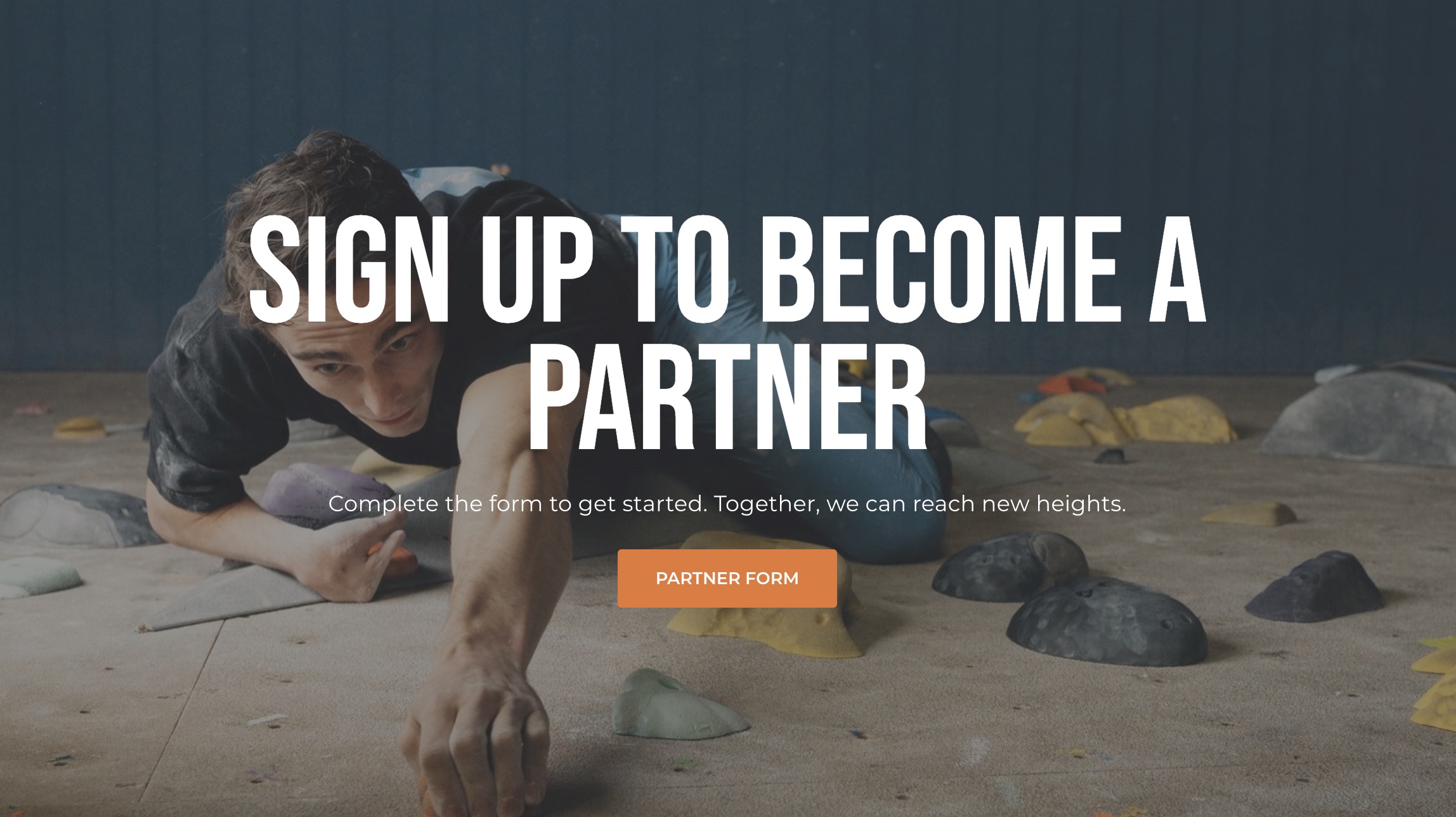
A flexible block that can be customized with any content, image, and call-to-action (CTA) link to create engaging banners on various pages. This block can be used for promotions, sign-up banners, announcements, and much more. The Banner Block is a versatile component used to highlight key messages, call-to-actions, or announcements with a background image and an optional CTA button. It is commonly used to grab the user's attention and direct them to other sections or forms on the website.
Key Elements:
- Title: The main heading of the banner.
- Content: The descriptive text, providing context or instructions for the user.
- Image: Background or supporting image for visual appeal.
- Call to Action Link: A button linking to a relevant page or form.
Use Case
The Banner Block can be utilized for various purposes such as:
- Partner Program Sign-Ups: Encourages users to register as partners.
- Promotional Banners: Highlights limited-time offers, promotions, or events.
- Announcements: Informs users about updates or important notifications.
This flexibility allows it to adapt to different types of content and CTA needs.
Example Configuration
Below is an example of a configuration setup for a general Banner Block:
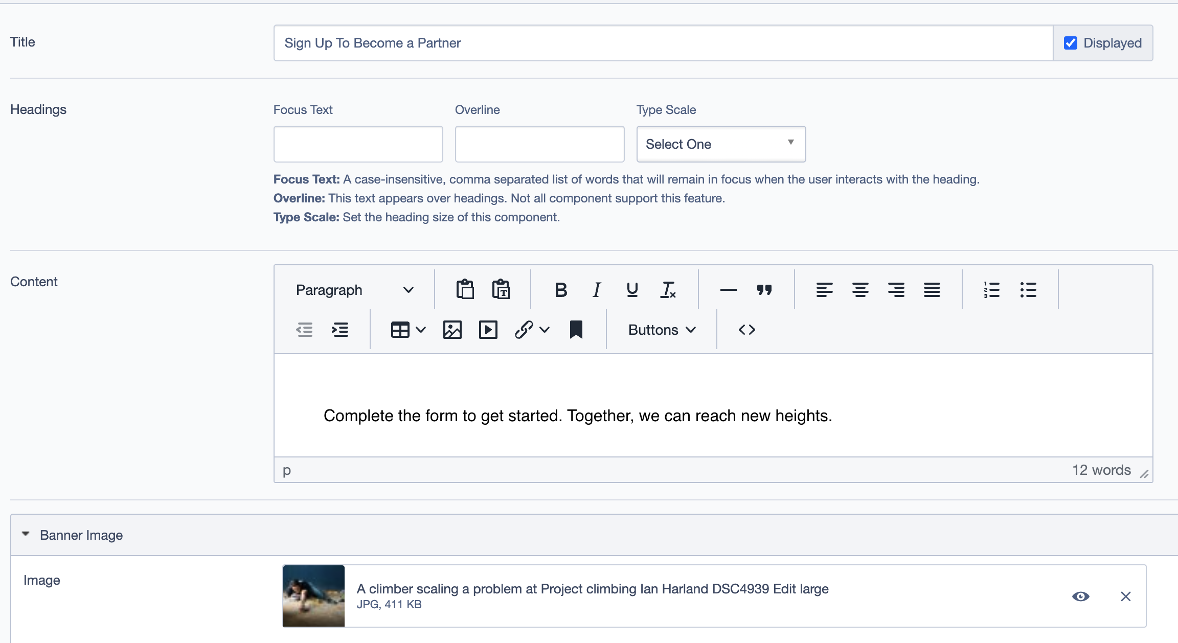
Title: Set the title of the block (e.g., "Step 3: Delicious Meals").
Headings:
- Focus Text: Keywords or phrases to keep in focus.
- Overline: Brief headline or descriptor above the title.
- Type Scale: Font size for headings.
Content: Add a concise description (1-2 lines) relevant to the image.
Banner Image: Select an image that visually represents partnership or collaboration.
Call To Action Link:
Label: "Learn More & Register"
Link: Directs to the partner registration form or further information page.
Settings
Display Options
- Custom CSS Classes: Add custom CSS classes for additional styling.
- ID and Label:
- Custom Block ID: Assign a unique identifier for custom styling or scripts.
- Label: Add a recognizable label for internal reference.
- Display Options:
- Display Content: Toggle to show or hide content.
- Display Links: Toggle to show or hide the call-to-action links.
- Enable Animation Support: Enable animations for enhanced visual interaction.
- Disable Title Text Overlay: Remove overlay if it obstructs the title text.
- Display Overline: Show or hide the overline text above the main heading.
Alignment Options
- Content Layout Position: Controls the overall layout position of the content.
- Content Text Alignment: Adjust text alignment within the block.
- Compact Content: Toggle for compacting content if necessary.
- Elevation: Sets the shadow depth of the block.
Responsive Grid Sizing
Controls the block's appearance across different screen sizes:
- Gap: Adjusts spacing.
- Orientation: Select portrait or landscape.
- Extra Small Phone Screens: Adjust settings for small screen devices.
- Tablet and Desktop: Define specific sizing for tablet and desktop views.
Responsive Grid Sizing
Define the grid settings for responsive layouts:
- Gap: Adjust the gap between elements.
- Orientation: Select portrait or landscape orientation.
- Extra Small Phone Screens: Specify grid behavior for small screens.
- Tablet and Desktop: Define column counts and spacing for tablet and desktop views.
Asset Aspect Ratios
- MM - Tablet-Wide (~1024px): 16:9, Landscape
- XS - Mobile (<320px): 1:1, Landscape
- XL - Desktop (~1920px): 21:9, Landscape
- SM - Tablet (~750px): 16:9, Landscape
- XXL - Desktop (>2500px): 21:9, Landscape
Advanced Options
- Custom Inline Styles: (Add inline styles as necessary)
- Inline Style Block: (Leave blank unless specific inline styling is required)
- Available globally: Checked
- Virtual Lookup Title: "Become a Partner (Banner #1603)" (Auto-generated for reference linking)
Best Practices
- Choose High-Quality Images: The image is often the first thing users notice. Make sure it’s relevant and visually appealing.
- Keep Text Concise: Users should understand the banner’s purpose at a glance. Keep the title and content brief and impactful.
- Use Clear Call to Actions: The CTA text should tell users exactly what to expect when they click.
- Optimize for All Screen Sizes: Use the responsive grid sizing and aspect ratios to ensure the banner looks good on desktop, tablet, and mobile devices.
Example Use Case