CTA Group Block
The CTA Group Block allows you to display a group of calls-to-action in a tile format, enabling users to access various resources directly from the block. This block is ideal for grouping related links or services, providing users with quick and easy access.
Block Configuration
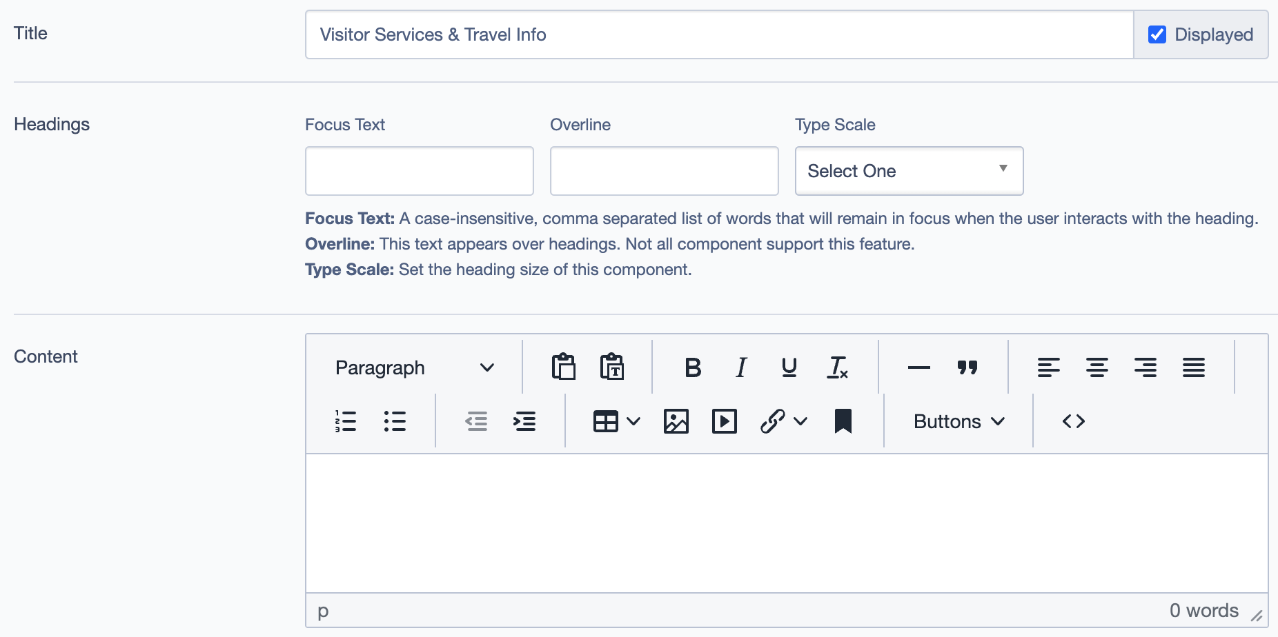
Title
- Field: Title of the block as it appears on the page.
- Example:
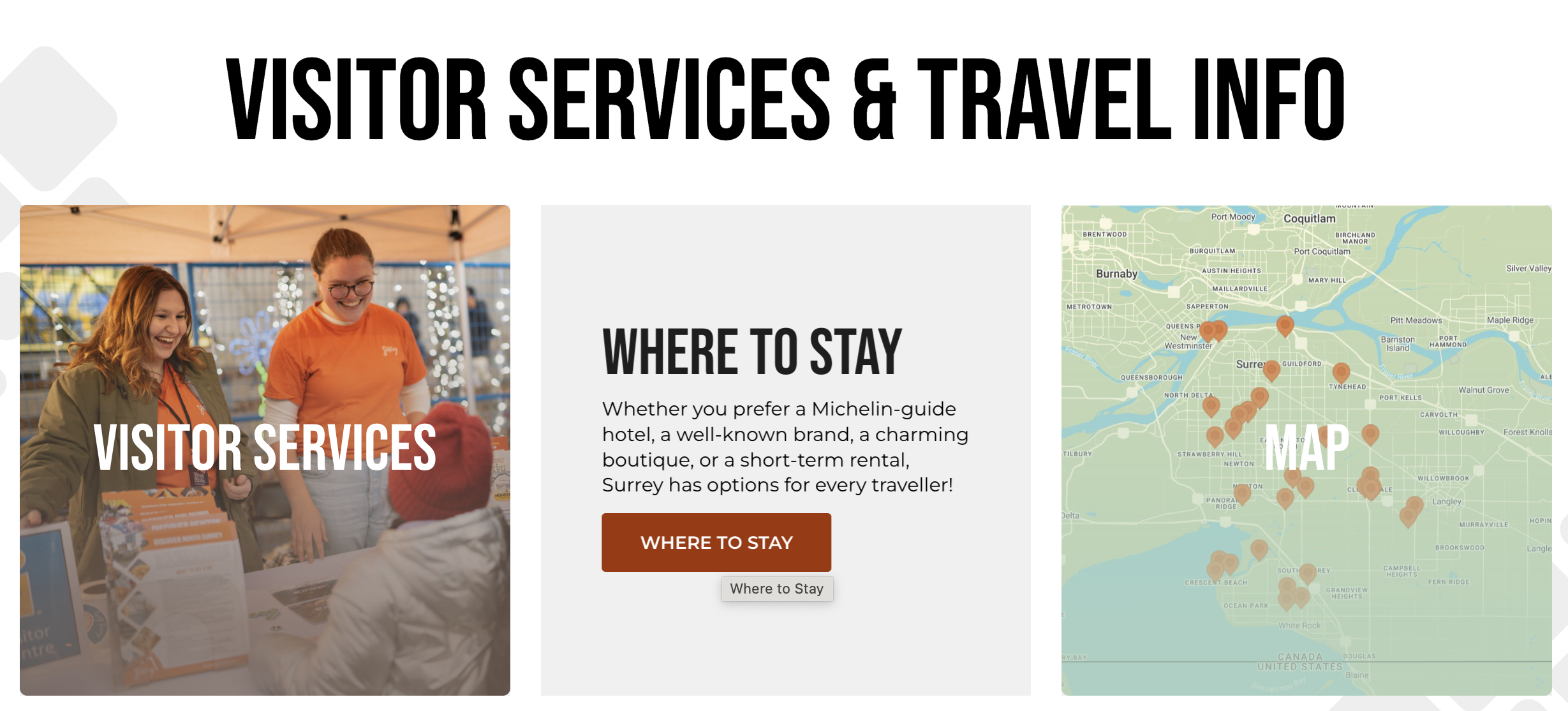
Visitor Services & Travel Info
Headings
- Focus Text: A comma-separated list of keywords that remain in focus when the user interacts with the heading.
- Overline: Optional text displayed above the main heading.
- Type Scale: Select the heading size for this block.
Content
- Content Editor: Add or edit introductory content displayed at the top of the block.
- Links: Add primary links, such as a "Learn More" button, to guide users to related resources.
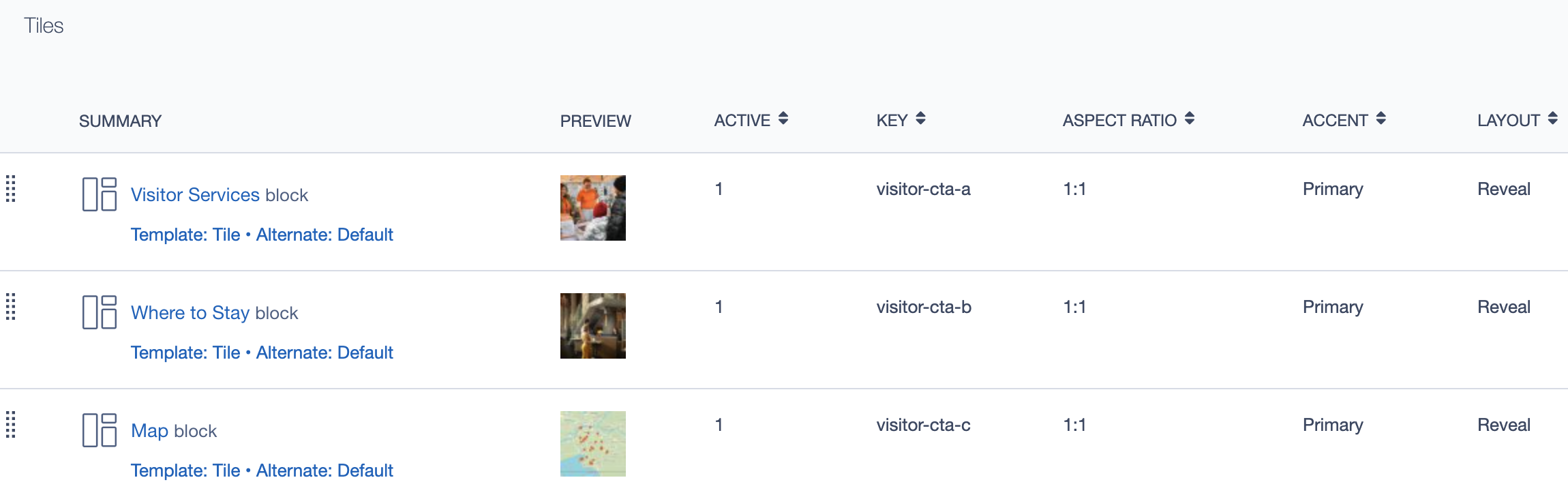
Tiles
- Add Block: Add individual tiles (blocks) within the CTA group to represent different resources.
- Blocks Included: Each tile can represent a resource, such as
Visitor Services,Where to Stay, orMap.- Templates: Choose templates like
Tile - Alternate: Defaultfor consistent styling. - Key: Assign a unique identifier for each tile for easy reference.
- Aspect Ratio: Set aspect ratios for visual consistency, typically
1:1. - Accent: Define a visual accent for each tile to differentiate it or emphasize the resource.
- Layout: Choose tile layout options, such as
Revealfor a dynamic effect.
- Templates: Choose templates like
Linked Pages
This block can link to multiple pages or sections. These links appear in a list under "Other Pages," showing the titles of each linked page. Common examples include:
- Experience
- Arts, Culture & Heritage
- Family Fun
- Indoor Activities, etc.
Settings
Custom CSS Classes
- Field: Option to add custom CSS classes for additional styling.
ID and Label
- Custom Block ID: Assign a unique identifier for backend reference.
- Label: Provide an optional label to describe the block’s purpose.
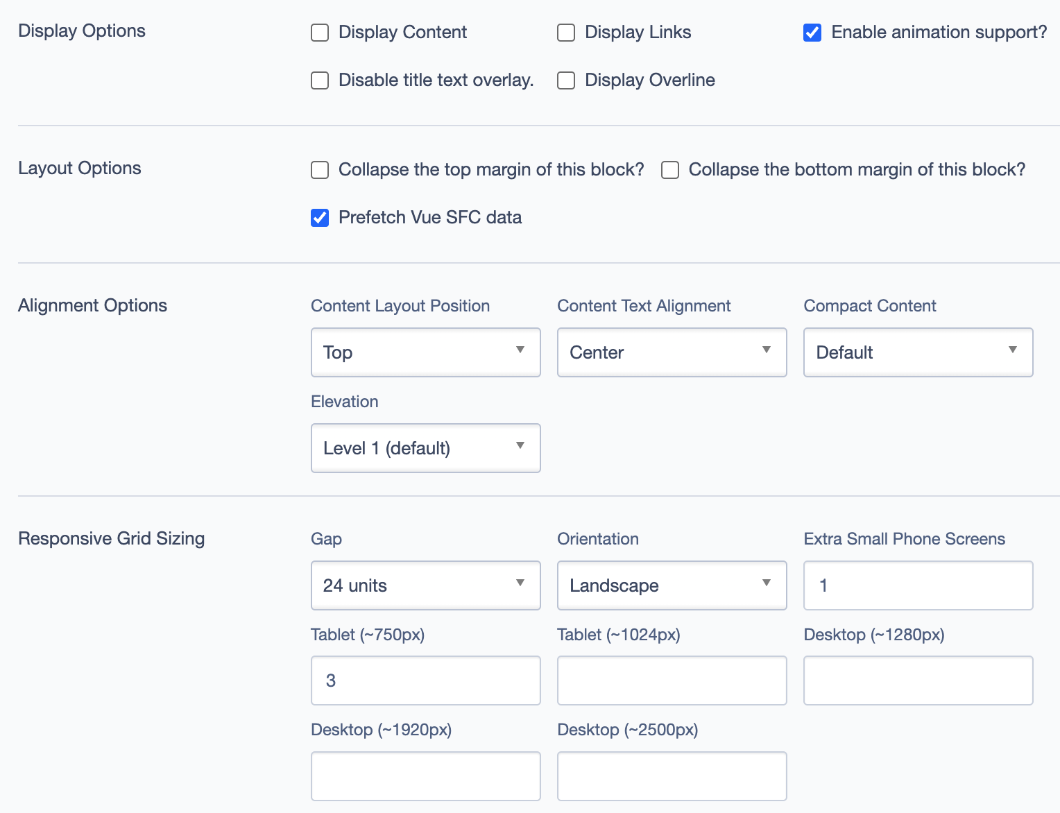
Display Options
- Display Content: Toggle to show or hide the main content.
- Display Links: Choose to display or hide additional links.
- Enable Animation Support: Toggle animation for enhanced visual appeal.
- Disable Title Text Overlay: Prevents text from overlaying the title.
- Display Overline: Show or hide the overline text.
Layout Options
- Collapse Top Margin: Collapse the top margin to reduce spacing.
- Collapse Bottom Margin: Collapse the bottom margin to reduce spacing.
- Prefetch Vue SFC Data: Optimize data fetching for Vue Single-File Components.
Alignment Options
- Content Layout Position: Choose the content’s vertical alignment:
- Top
- Center
- Content Text Alignment: Align the text horizontally within the block. Options include
LeftorCenter. - Compact Content: Adjust the density of the content within the block.
Defaultis the standard setting. - Elevation: Adjusts the visual elevation or shadow effect of the block. Default is
Level 1.
Responsive Grid Sizing
Configure how the block displays on various screen sizes:
- Gap: Set spacing between tiles, e.g.,
24 units. - Orientation: Control layout orientation, such as
Landscape. - Extra Small Phone Screens, Tablet, Desktop: Set specific layouts for different screen breakpoints.
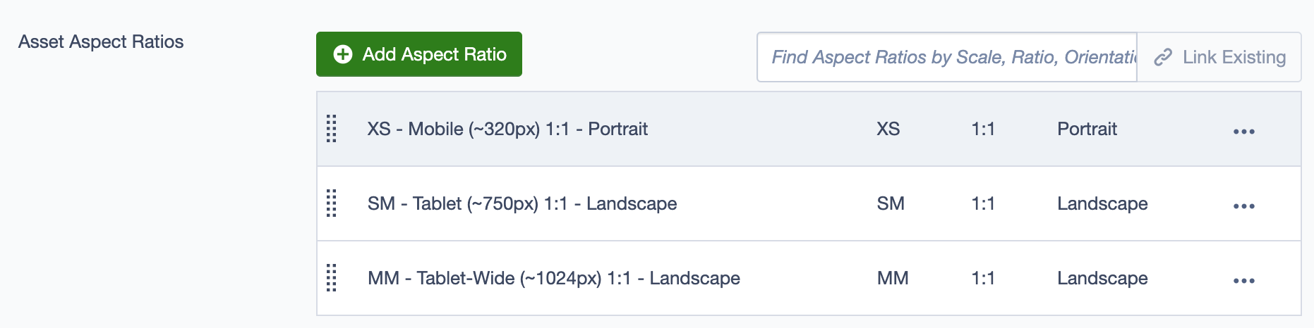
Asset Aspect Ratios
Define aspect ratios for optimal display across devices:
- XS - Mobile (~320px): 1:1 Portrait
- SM - Tablet (~750px): 1:1 Landscape
- MM - Tablet-Wide (~1024px): 1:1 Landscape
Best Practices
- Consistency in Styling: Use similar aspect ratios and alignments across tiles for a clean, cohesive look.
- Descriptive Titles: Ensure each tile title is clear and descriptive to help users understand the purpose of each link.
- Minimize Content Overload: Limit the number of tiles in one block to avoid overwhelming users. Group tiles logically by theme or purpose.
- Responsive Configuration: Verify that the block looks good on all devices by testing the responsive settings.
- Enable Animations Sparingly: Use animations where appropriate to draw attention, but avoid overuse, as it may distract users from key information.
Usage Example
For a Visitor Services & Travel Info section, the CTA Group Block can include tiles such as:
- Visitor Services: A tile linking to visitor resources.
- Where to Stay: Information on accommodation options.
- Map: An interactive map for navigation.