Crowdriff Gallery Block
The Crowdriff Gallery Block allows you to showcase a collection of user-generated images or curated galleries. It provides an engaging, visually appealing way to display content through a grid layout, supporting a resource ID for dynamic loading.
Block Configuration
Title
- Field: Title of the block as it appears on the page.
- Example:
Experience Surrey - Crowdriff Gallery
Headings
- Focus Text: List of comma-separated keywords for focus.
- Overline: Text displayed above the main heading.
- Type Scale: Choose the heading size.
Content
- Content Editor: Add or edit text content displayed within the block.
Resource ID
- Field: Unique identifier for the content source within the Crowdriff system.
- Example:
9de97a17a85e521d
Links
- Add Link: Option to add custom links, including query strings or anchors if necessary.
Settings
Custom CSS Classes
- Field: Specify any custom CSS classes to style the block uniquely.
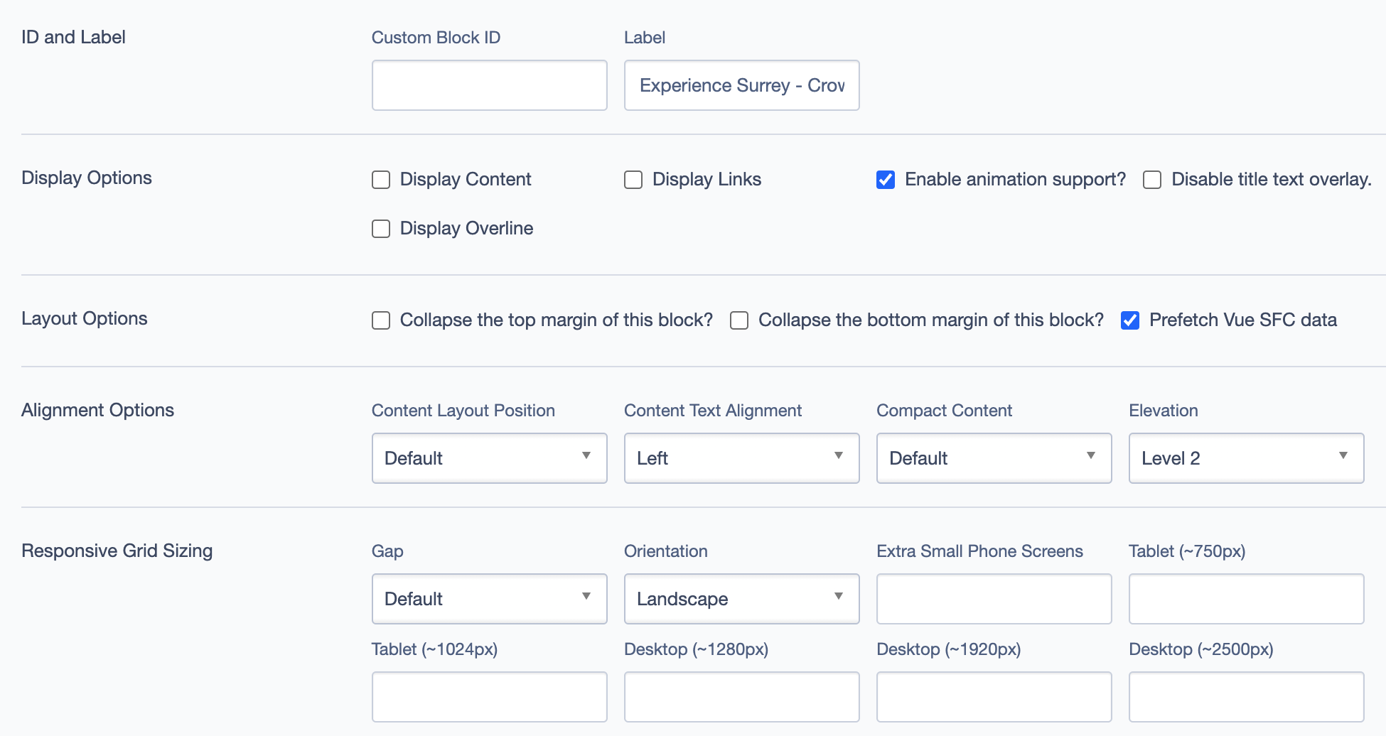
ID and Label
- Custom Block ID: Assign a unique identifier.
- Label: Optional descriptive label.
Display Options
- Display Content: Show or hide text content within the block.
- Display Links: Show or hide links.
- Enable Animation Support: Toggle animations for the block.
- Disable Title Text Overlay: Prevents text overlay on the title.
- Display Overline: Display an overline above the main title.
Layout Options
- Collapse Top Margin: Enables collapsing the top margin of the block.
- Collapse Bottom Margin: Enables collapsing the bottom margin of the block.
- Prefetch Vue SFC Data: Optimize data fetching for Vue Single-File Components.
Alignment Options
- Content Layout Position: Set the position of the content within the block. Options include:
- Default
- Center
- Content Text Alignment: Align text content within the block, such as
Left. - Compact Content: Adjusts the content density, with options like
Default. - Elevation: Adjusts the block elevation, with options like
Level 2.
Responsive Grid Sizing
- Gap: Set spacing between items, e.g.,
Default. - Orientation: Set the orientation of the block layout, e.g.,
Landscape. - Extra Small Phone Screens, Tablet, Desktop: Configure layout for various screen sizes.
Asset Aspect Ratios
Define aspect ratios for different screen sizes.
Best Practices
- Use High-Quality Images: To maintain visual appeal, ensure the images are high-resolution.
- Leverage Animation: Enable animations for a more dynamic and engaging gallery experience.
- Set Appropriate Resource IDs: Ensure the Resource ID is set correctly to pull the intended gallery from Crowdriff.
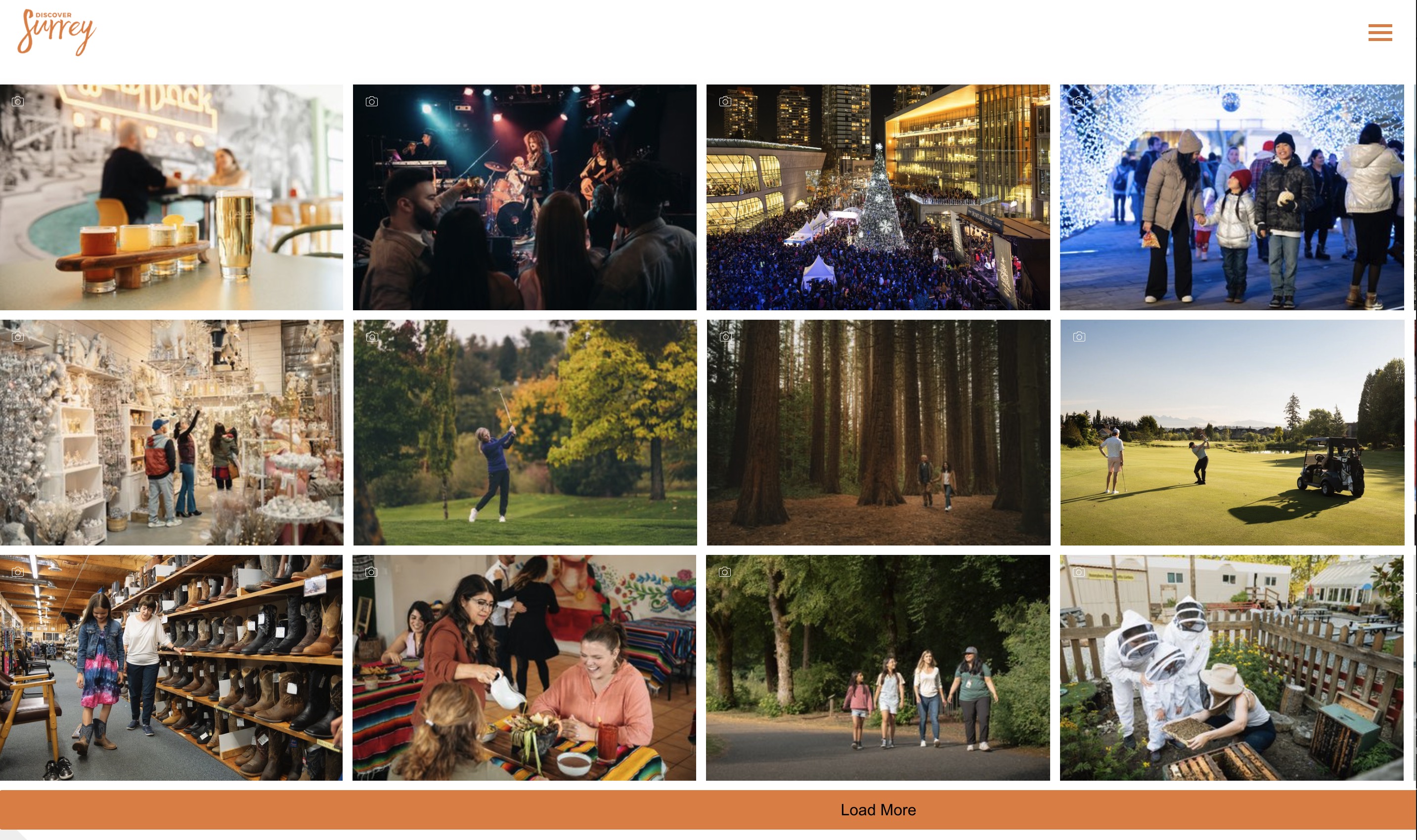
Example Layout
The Crowdriff Gallery Block can be used to showcase a gallery of images related to experiences in Surrey. With dynamic content loaded via the Resource ID, this block pulls images from a pre-defined set in Crowdriff, displaying them in an interactive grid format. Users can click on images to view larger versions or to get more context.
Example of the Crowdriff Gallery Block in action: