Taxonomy List Block
The Taxonomy List Block is used to display a categorized list of terms, allowing users to explore specific areas of interest in a structured list format.
Block Configuration
Title
- Field: Title of the block as it appears on the page.
- Example:
Taxonomy List
Headings
- Focus Text: List of comma-separated keywords for focus.
- Overline: Text displayed above the main heading.
- Type Scale: Choose the heading size.
Content
- Content Editor: Add or edit descriptive content displayed within the block.
Type
- Category: Select one taxonomy type to render its terms.
Terms
- Select Terms: Choose specific terms related to the selected taxonomy category.
Links
- Add Link: Option to add a link, such as "Learn More" or "See All Categories."
Settings
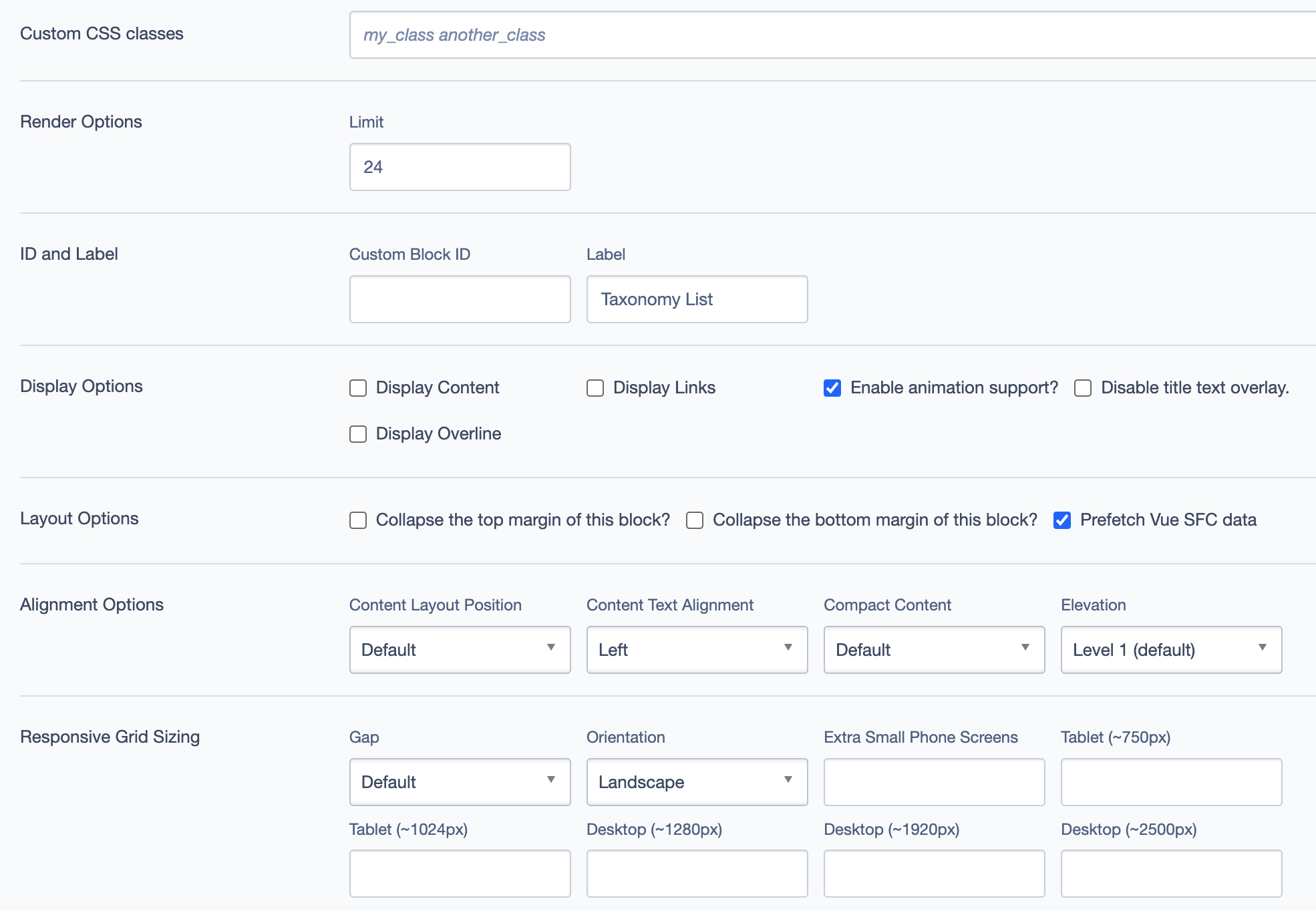
Custom CSS Classes
- Field: Specify any custom CSS classes for styling.
Render Options
- Limit: Define the maximum number of items to display in the list.
ID and Label
- Custom Block ID: Assign a unique identifier for the block.
- Label: Optional descriptive label for the block.
Display Options
- Display Content: Show or hide content.
- Display Links: Show or hide links.
- Enable Animation Support: Toggle animations.
- Disable Title Text Overlay: Prevents text overlay on title.
- Display Overline: Display an overline text above the title.
Layout Options
- Collapse Top Margin: Enables collapsing the top margin of the block.
- Collapse Bottom Margin: Enables collapsing the bottom margin of the block.
- Prefetch Vue SFC Data: Optimize data fetching for Vue Single-File Components.
Alignment Options
- Content Layout Position: Set the position of the content within the block. Options include
Default. - Content Text Alignment: Align the text content within the block, such as
Left. - Compact Content: Adjust content density. Options:
Default. - Elevation: Set block elevation level, such as
Level 1 (default).
Responsive Grid Sizing
- Gap: Set spacing between items, e.g.,
Default. - Orientation: Choose block layout orientation, e.g.,
Landscape. - Extra Small Phone Screens, Tablet, Desktop: Configure layout for various screen sizes.
Asset Aspect Ratios
Define aspect ratios for different screen sizes if needed.
Custom Inline Styles
- Add Elemental Style Property: Apply inline styles directly to the block.
Virtual Lookup Title
- Field: This field is automatically generated and provides a unique title for the block.
Best Practices
Select Relevant Terms: Choose categories and terms that best represent the interests of your target audience.
Use Descriptive Content: Provide brief descriptions for each term to make it easier for users to navigate.
Limit Number of Terms: Avoid overwhelming users with too many items; focus on the most relevant and popular categories.
Enable Links for Easy Navigation: Add relevant links to direct users to additional content and make navigation smoother.
Example Use Case
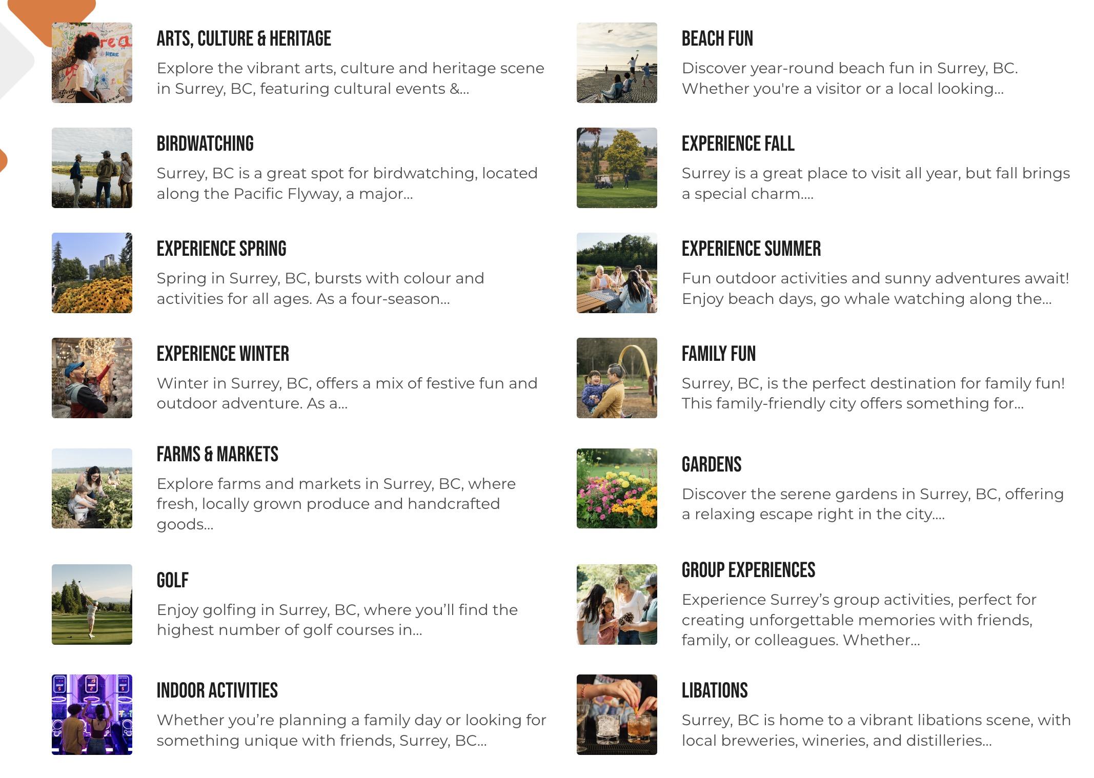
The Taxonomy List Block can be used on an "Explore Surrey" page to categorize and display various attractions, activities, and other points of interest in Surrey. Each list item links to a detailed page on the selected topic, such as "Parks & Trails" or "Arts & Culture."
Screenshots
Block Displayed on Frontend