Repeater Block
Description
This block is used to showcase a list of the latest stories or articles. It includes a title, a grid or slider view for displaying posts, and allows customization of the layout, pagination, and glider (carousel) settings.
Settings
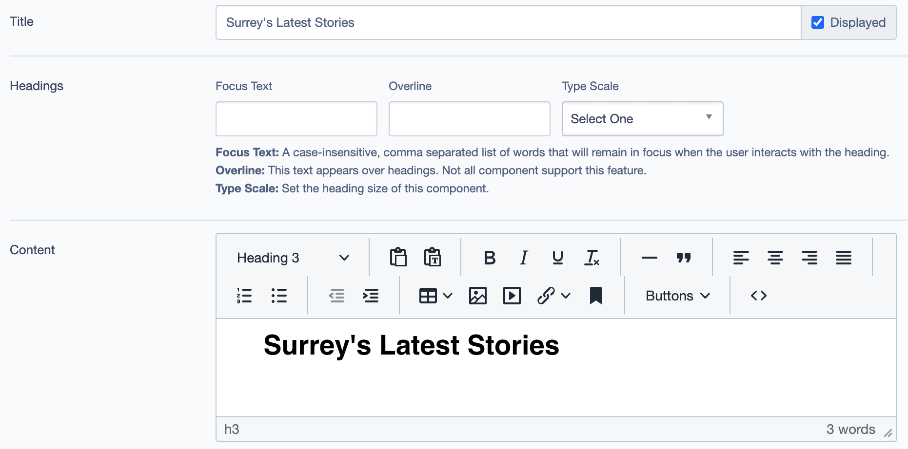
Title: The main heading displayed at the top of the block.
Headings:
- Focus Text: A list of comma-separated keywords that stay in focus when users interact with the heading.
- Overline: Text appearing above the main heading.
- Type Scale: Allows selection of the heading size.
Content:
- Text Field: A rich text editor for adding introductory or descriptive text for the stories section.
Layout Options
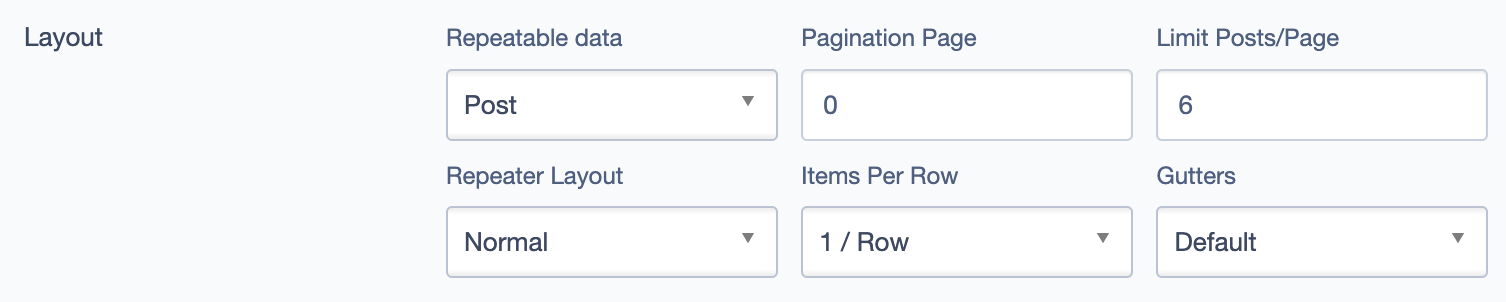
- Repeatable Data: Set to "Post" to pull in posts dynamically.
- Pagination Page: Determines the starting page for pagination.
- Limit Posts/Page: Number of posts displayed per page.
- Items Per Row: Configure how many posts appear in each row.
- Gutters: Space between items.
Call To Action Link
- Add Link: Optional link to direct users to a different page, resource, or detailed listing.
Glider (Carousel) Settings
Slides to Show: Number of items shown at once.
Slides to Scroll: Number of slides that scroll in each movement.
Item Width: Adjusts width for each item in the carousel.
Autoplay: Enables auto-rotation of the carousel.
Loop: Repeats slides in a continuous loop.
Animation Settings:
- Effect: Choose from various transition effects.
- Autoplay Delay: Set a delay for autoplay in seconds.
Scroll Settings:
- Show Controls: Displays navigation controls.
- Scroll Lock: Prevents additional scroll beyond the available items.
- Resize Lock: Locks size to avoid distortion.
Alignment Options
- Content Layout Position: Adjusts the positioning of content within the block (e.g., Default, Centered).
- Content Text Alignment: Sets text alignment within the block (e.g., Left, Center, Right).
- Compact Content: Allows for a more condensed presentation of the content if enabled.
- Elevation: Adjusts the elevation or "depth" appearance of the block (e.g., Level 1 - default).
Responsive Grid Sizing
- Gap: Controls the spacing between items in different screen sizes.
- Orientation: Choose between Landscape or Portrait mode.
- Aspect Ratios: Predefined aspect ratios for different screen sizes:
- SM - Tablet (~750px): 1:1 Landscape
- MM - Tablet-Wide (~1024px): 1:1 Landscape
- XS - Mobile (~320px): 1:1 Portrait
Custom Inline Styles
- CSS Classes: Option to add custom CSS classes for styling.
- Inline Style Block: Directly input custom styles to apply specific formatting to this block.
Additional Options
- Display Options: Toggle to show or hide elements like content, links, and overline.
- Alignment Options: Adjust content layout position, text alignment, and elevation.
Best Practices
Plan Content: Decide which posts should be featured to ensure relevance.
Limit Posts: Keep the number manageable for a better user experience.
Engaging Images: Use appealing images to capture attention.
Carousel Settings: Test settings for smooth transitions.
Check Responsiveness: Ensure the block looks good on all devices.
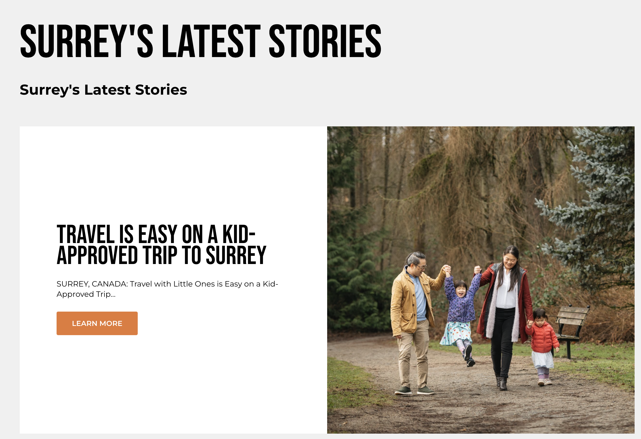
Example