Page Header Block
The Page Header block is used to create a visually appealing header for a page, providing essential context to the user about the content that follows. This block typically includes a title, focus text, overline, and additional media or content elements, such as images, links, or videos. It provides flexibility for displaying a main title, headings, and introductory content at the top of a page. Additional customization options include animations, case style, image backgrounds, and alignment settings.
Settings
Content Settings
- Title: The main title for the header.
- Headings:
- Focus Text: A comma-separated list of keywords to remain in focus when users interact with the heading.
- Overline: A smaller line of text that appears above the main heading.
- Type Scale: Controls the font size of the heading.
- Content: Rich text editor for adding introductory text, images, links, and additional formatting options.
Media & Content Settings
- Case: Controls text casing with options such as:
- Normal
- Title
- Uppercase
- Lowercase
- Animation: Adds motion to the block with options:
- None
- Scale
- Parallax
- Depth: Sets the depth (elevation) of the block for a 3D effect:
- Normal
- Shallow
- Deep
- Decoration: Adds decorative elements to the block. Options include:
- None
- Waves
- Vanishing Point
- Hills
- Image: Allows for uploading or selecting an image as a background.
Links
To add a link, click on the Add Link button, which opens the following options:
- Title: Optional. If left blank, the title is auto-generated from the link.
- Button Label: Override the button text. Typically, the title field is used in most contexts.
- Type: Select the link type, with options including:
- Page on this website
- URL
- Email address
- Phone number
- File on this website
- URL: Enter the URL for the link, applicable when Type is set to URL.
- Open link in a new window: Option to open the link in a new browser tab.
- Add'l Options:
- Unique Key: A unique identifier for the link.
- Link Relations: Define link relationships (e.g., "nofollow").
- Extra CSS: Apply additional CSS classes for custom styling.
- Description: Add a description for the link.
- Image: Optionally, upload or select an image to display alongside the link in navigation contexts.
Additional Settings
Layout & Display Options
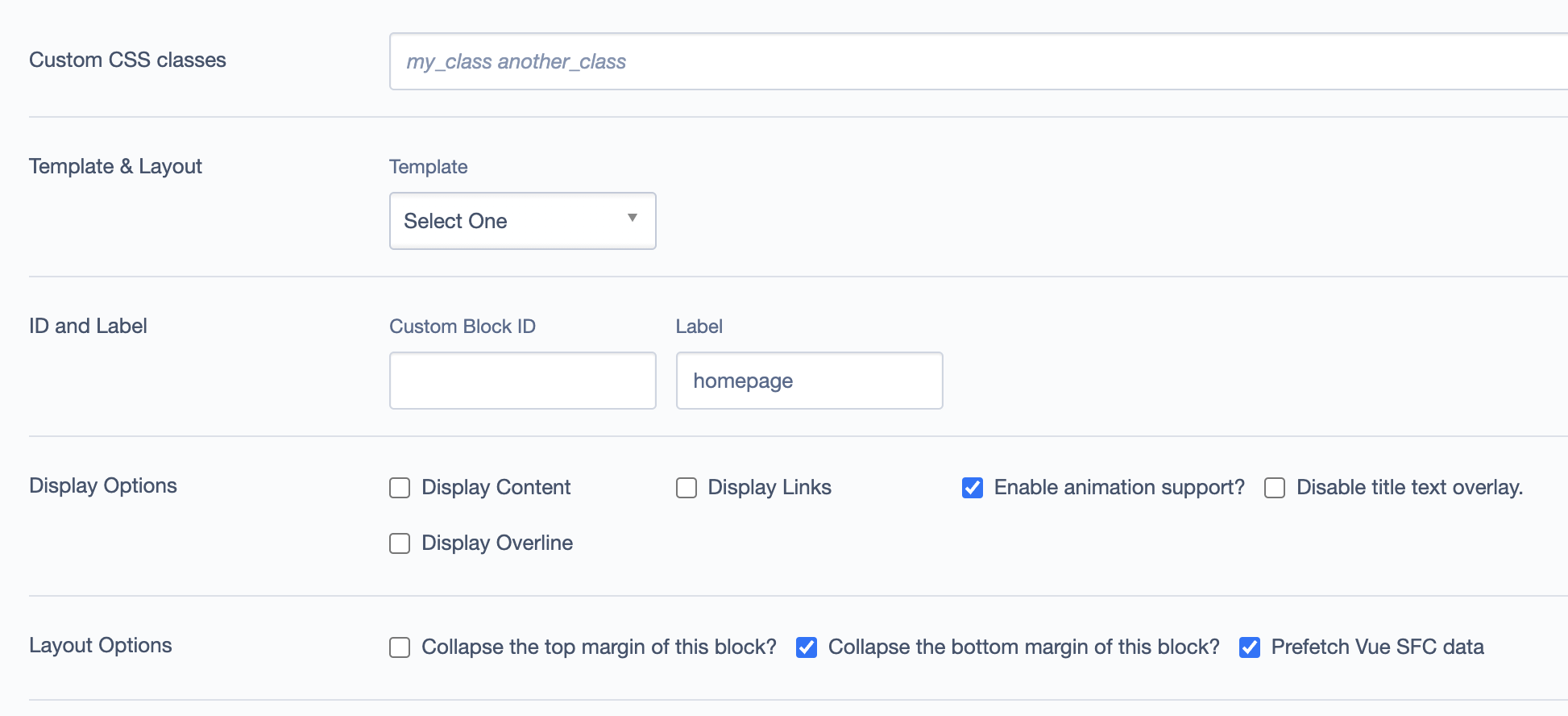
- Custom CSS classes: Add custom CSS classes for styling.
- Template & Layout: Choose a template layout for the block.
- ID and Label:
- Custom Block ID: Unique identifier for custom configurations.
- Label: Provides a recognizable label, e.g.,
homepage.
- Display Options:
- Enable or disable options such as "Display Content," "Display Links," "Display Overline," and "Enable animation support."
- Layout Options:
- Collapsible top and bottom margins.
- Prefetch Vue SFC data for enhanced loading.
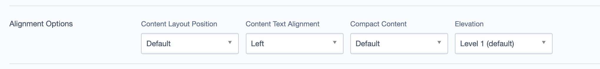
Alignment Options
- Content Layout Position: Controls the overall layout position of the content.
- Content Text Alignment: Adjust text alignment within the block.
- Compact Content: Toggle for compacting content if necessary.
- Elevation: Sets the shadow depth of the block.
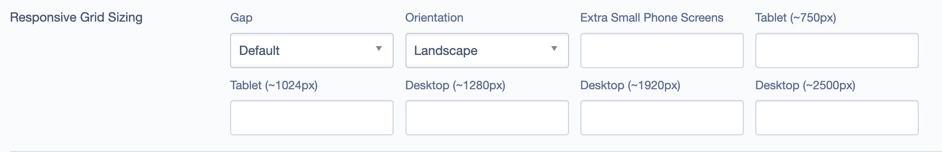
Responsive Grid Sizing
Controls the block's appearance across different screen sizes:
- Gap: Adjusts spacing.
- Orientation: Select portrait or landscape.
- Extra Small Phone Screens: Adjust settings for small screen devices.
- Tablet and Desktop: Define specific sizing for tablet and desktop views.
Asset Aspect Ratios
Define aspect ratios for different screen sizes:
- MM - Tablet-Wide (~1024px) 16:9 - Landscape
- XS - Mobile (~320px) 16:9 - Portrait
- XL - Desktop (~1920px) 21:9 - Landscape
- SM - Tablet (~750px) 1:1 - Landscape
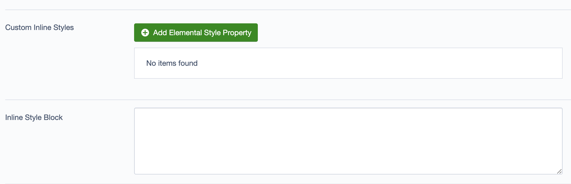
Custom Inline Styles
Option to add custom Elemental style properties.
Inline Style Block
Allows inline CSS styles to be added directly within the block.
Best Practices
- Use this block as the first section of the page to establish the main title or introductory content.
- Keep the focus text concise for improved readability and impact.
- Ensure image/video backgrounds align with brand guidelines and enhance the visual appeal without distracting from the text.
- Choose a high-quality video that represents the brand’s message or the homepage’s purpose.
- Keep the video short and looped without sound to maintain user engagement without distractions.
- Ensure the video doesn’t overshadow the text; use overlays if the video is too bright or complex.
Example Use Cases
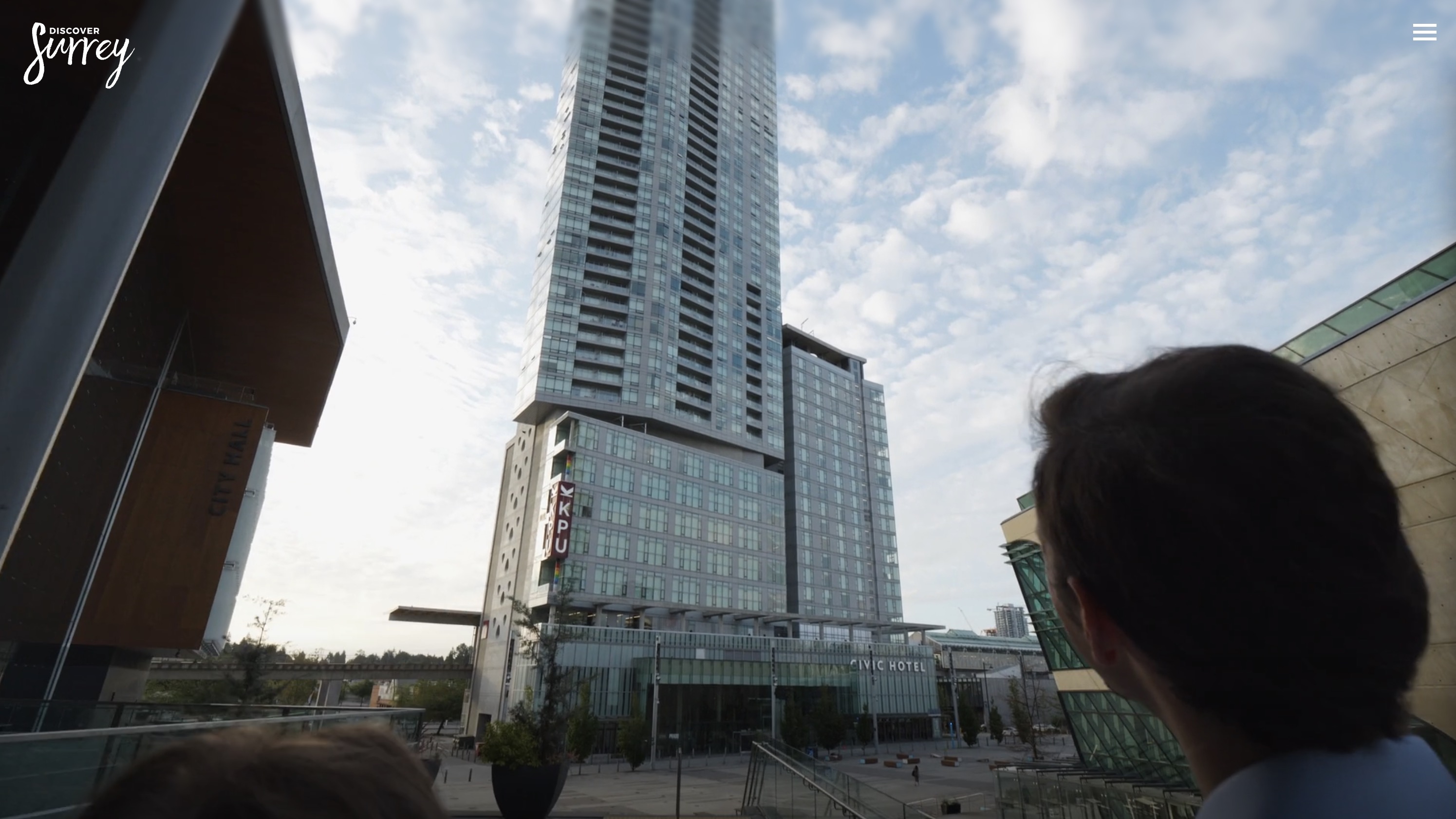
- Homepage Header: showing the Page Header block with a video background in use:
Here is example screenshot showing the Page Header block in use: