Event Showcase Block
The Event Showcase Block provides a dynamic way to feature upcoming or highlighted events on a webpage. This block pulls data from a calendar and displays events with essential details and links for further information.
Block Configuration
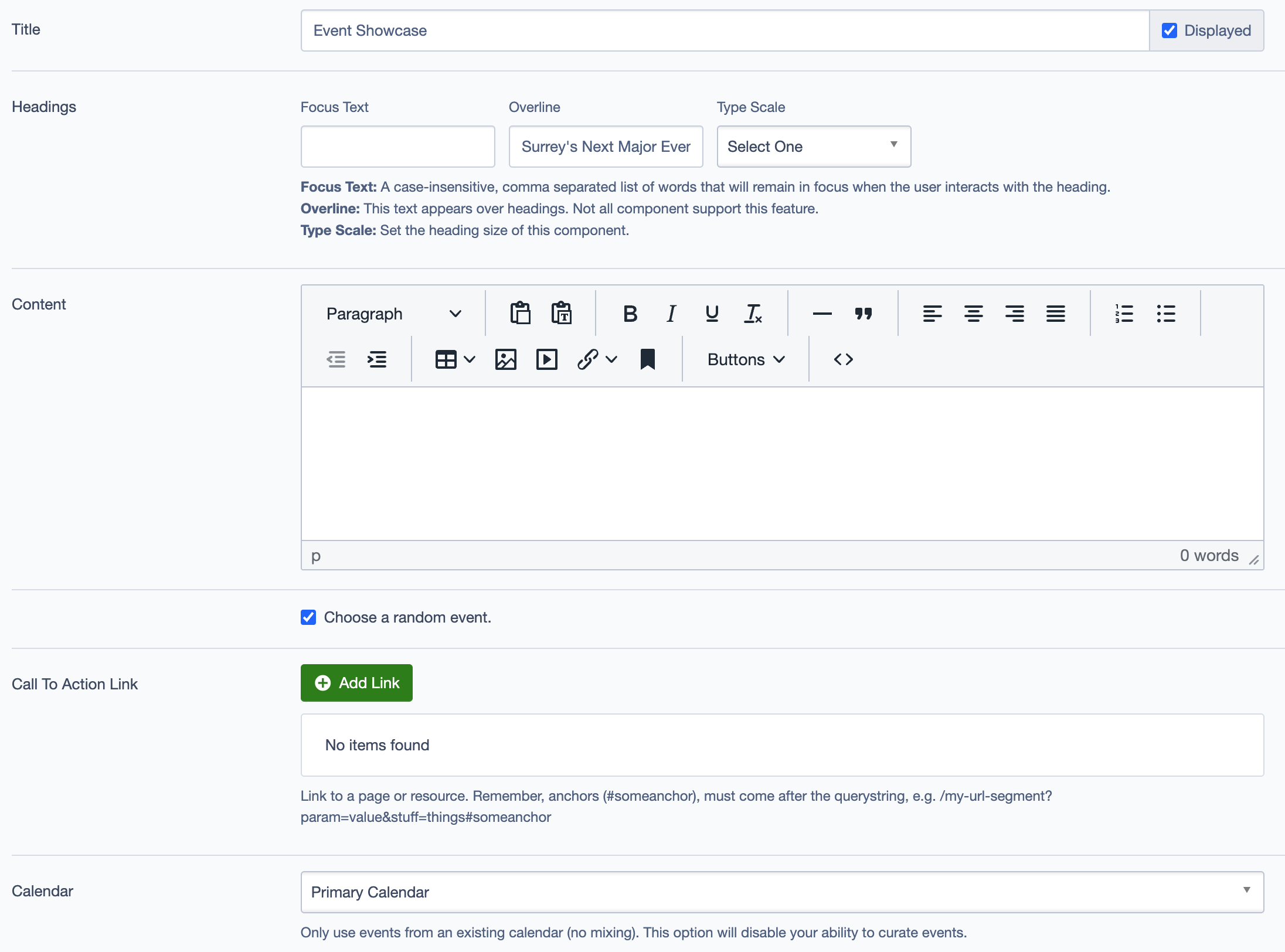
Title
- Field: Title of the block as it appears on the page.
- Example:
Event Showcase
Headings
- Focus Text: Comma-separated list of keywords for focusing user interaction.
- Overline: Text displayed above the main heading.
- Type Scale: Choose the heading size for better design consistency.
Content
- Content Editor: Add or edit the descriptive text to provide context for the event(s) being showcased.
- Links: Option to add a link (e.g., "Learn More" button) to direct users to further event details.
Calendar
- Event Limit: Set the maximum number of events to display.
- Calendar Source: Choose the calendar to pull event data from, such as:
Primary CalendarMobile Visitor Service Calendar
Settings
Custom CSS Classes
- Field: Add any custom CSS classes for styling.
ID and Label
- Custom Block ID: Assign a unique identifier for the block.
- Label: Add a descriptive label for organizational purposes.
Display Options
- Display Content: Toggle to show or hide the content section.
- Display Links: Toggle to show or hide links.
- Enable Animation Support: Enable animations if needed.
- Display Overline: Toggle to show or hide the overline text.
Layout Options
- Collapse Top Margin: Option to remove the top margin.
- Collapse Bottom Margin: Option to remove the bottom margin.
- Prefetch Vue SFC Data: Option to prefetch data for better performance.
Alignment Options
- Content Layout Position: Set the content position within the block.
- Content Text Alignment: Align the text content.
- Compact Content: Adjust the content density.
- Elevation: Set the block’s elevation for visual depth.
Responsive Grid Sizing
- Gap: Set the spacing between grid items, e.g.,
Default,24 units. - Orientation: Choose between
LandscapeorPortrait. - Responsive Sizes: Define settings for different screen sizes:
- Tablet (~1024px), Desktop (~1280px), etc.
Asset Aspect Ratios
- Add Aspect Ratio: Customize the aspect ratio for images displayed in the block based on screen size, such as:
- XS - Mobile (~320px):
1:1 Portrait - SM - Tablet (~750px):
1:1 Landscape - MM - Tablet-Wide (~1024px):
1:1 Landscape
- XS - Mobile (~320px):
Best Practices
- Limit Events: Set a reasonable limit on the number of events displayed to maintain a clean, focused layout.
- Use Aspect Ratios: Ensure aspect ratios are set correctly to maintain consistent image presentation across devices.
- Descriptive Labels: Use meaningful labels for better organization and to help identify the block in content management systems.
Example Use Case
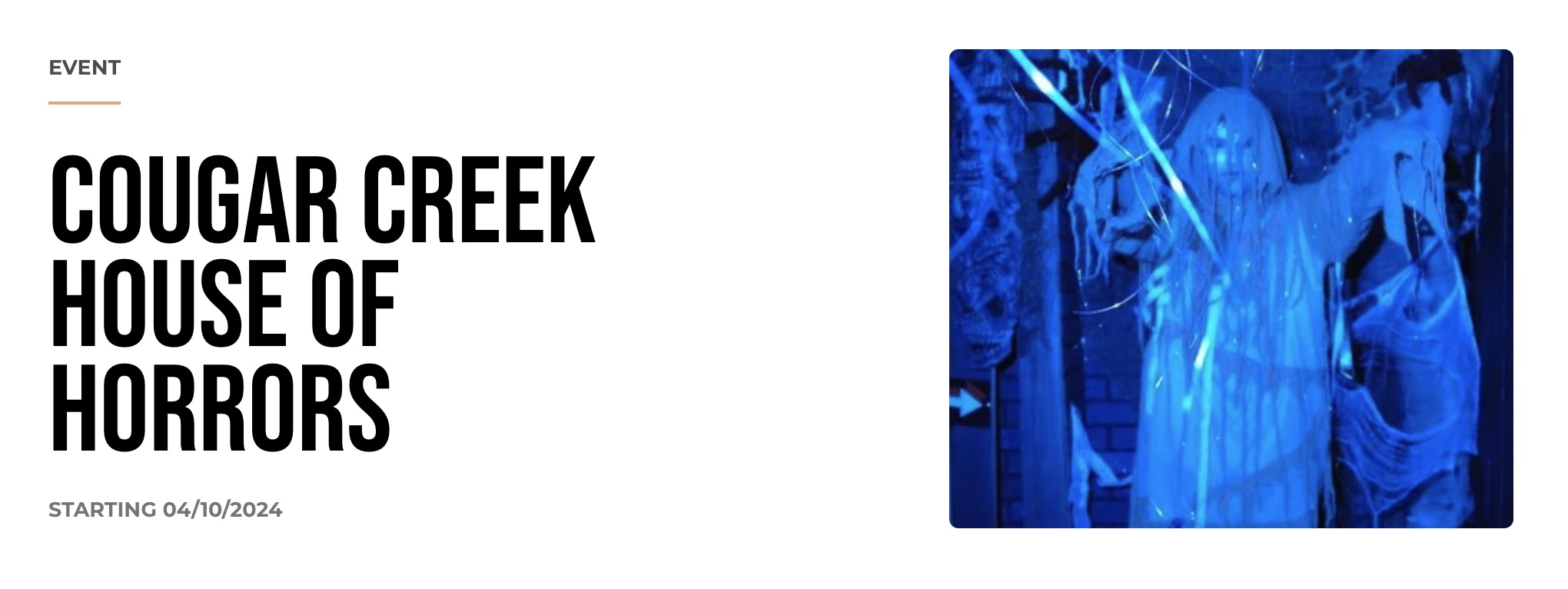
The Event Showcase Block can be used on an events page to highlight key upcoming events. For example, it can showcase seasonal events like Cougar Creek House of Horrors during Halloween or Surrey Tree Lighting Festival during winter. Each event displays relevant details and links to additional information.