Content Block
The Content Block is used for adding informative text and descriptions to a page. This block allows for customizable content with options to display focus text, overlines, and links, making it suitable for presenting detailed information about a topic or section.
Block Configuration
Title
- Field: The title of the block as it appears on the page.
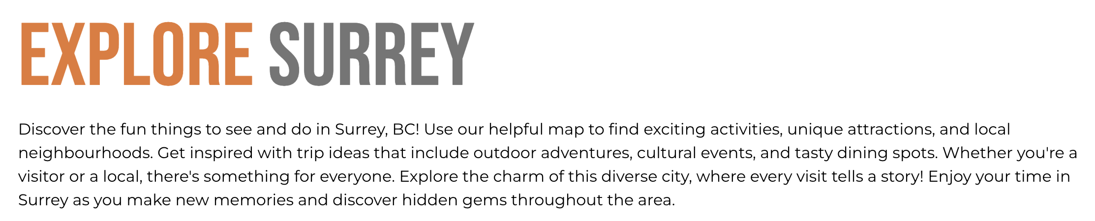
- Example:
Explore Surrey
Headings
- Focus Text: Keywords that remain highlighted when a user interacts with the heading.
- Overline: Text displayed above the main heading to add context.
- Type Scale: Select the heading size from the available options.
Subtitle
- Field: Optional subtitle that appears below the title.
Content
- Content Editor: A rich-text editor to add the main body content for the block. This can include formatted text, images, and links to enhance the content visually.
Links
- Add Link: Option to add clickable links, such as a "Learn More" button, directing users to additional resources or other sections on the site.
Settings
Custom CSS Classes
- Field: Specify any custom CSS classes for styling customization.
ID and Label
- Custom Block ID: Assign a unique identifier for the block.
- Label: Optional label to identify the block’s purpose or content.
Display Options
- Display Content: Toggle to show or hide the main content.
- Display Links: Toggle to show or hide any links.
- Enable Animation Support: Enable animations for content entry.
- Disable Title Text Overlay: Prevents the title text from overlaying the background.
- Display Overline: Display or hide the overline text.
Layout Options
- Collapse Top Margin: Collapse the space above the block.
- Collapse Bottom Margin: Collapse the space below the block.
- Prefetch Vue SFC Data: Enable prefetching of data for Vue Single-File Components.
Alignment Options
- Content Layout Position: Choose the content position within the block (e.g.,
Center). - Content Text Alignment: Align text within the block, options include
Left,Center,Right. - Compact Content: Adjust content density with options like
Default. - Elevation: Set the visual depth of the block, with levels such as
Level 1 (default).
Responsive Grid Sizing
- Gap: Define the spacing between items, with options like
Default. - Orientation: Choose the block layout orientation, e.g.,
Landscape. - Responsive Settings: Configure layout for different screen sizes, including:
- Tablet (~1024px)
- Desktop (~1280px)
- Extra Small Phone Screens
Asset Aspect Ratios
Set aspect ratios to control image proportions based on screen size. This block doesn’t typically use aspect ratios, but they can be added if necessary.
Custom Inline Styles
- Add Elemental Style Property: Customize inline styles directly within the block for additional styling needs.
Best Practices
- Use clear and engaging language to inform the user effectively.
- Align content text appropriately based on the page layout to ensure readability.
- Keep links concise and relevant to encourage user interaction.
- Ensure responsive settings are configured for optimal display on all devices.
Usage Example
The Explore Surrey Content Block provides a brief overview of things to see and do in Surrey, BC. It includes a rich description and highlights unique attractions, using a combination of text, links, and optional imagery for a visually engaging presentation. This setup is optimized for desktop and mobile viewing, ensuring a responsive design across devices.