Callout Block
The Callout block is designed to highlight key information or welcome messages with impactful text and visuals. This block is ideal for drawing attention to specific content areas, such as a welcome message, promotional section, or important announcement. It provides a structured layout for a title, descriptive content, images, and call-to-action links. It’s often used to make announcements or introduce a page section with engaging visuals and text that can link to additional resources.
Settings
Content Settings
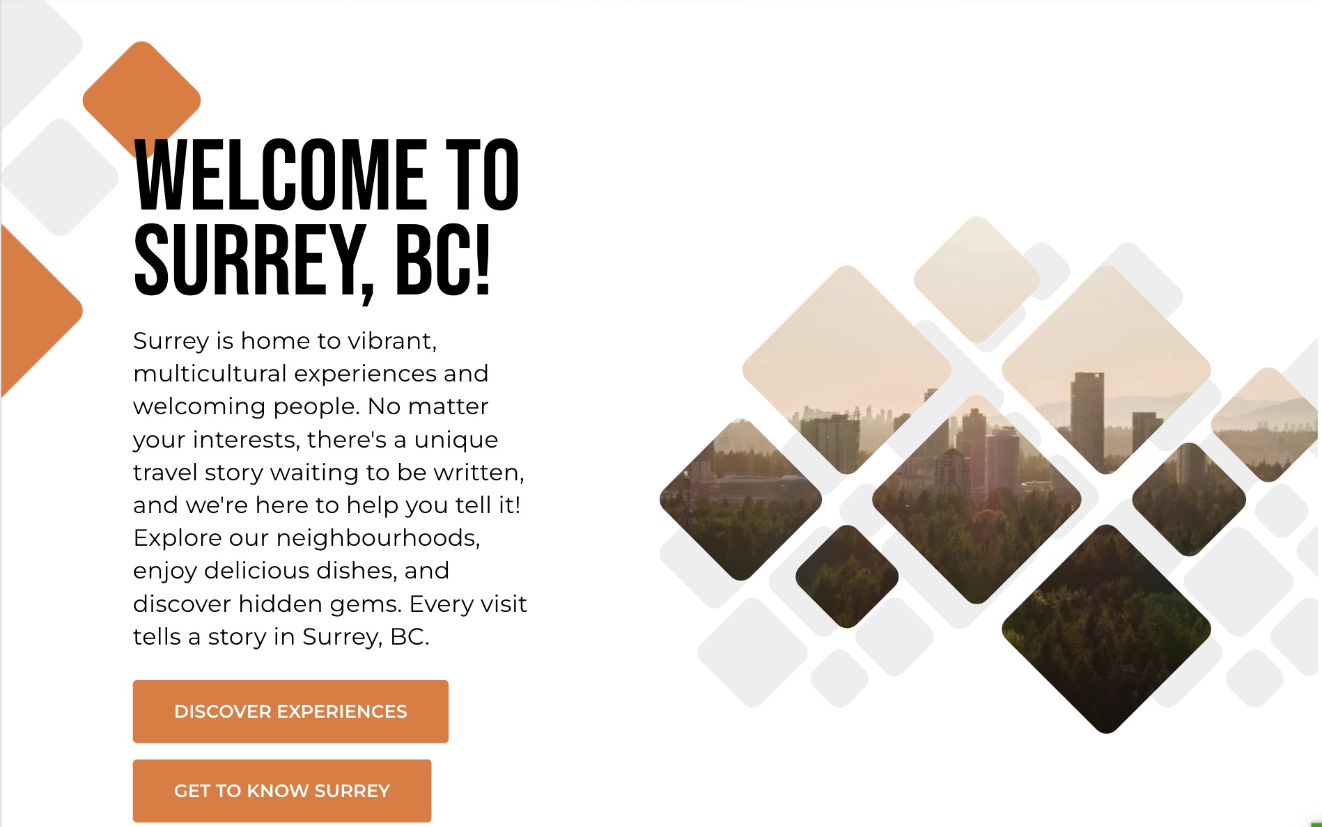
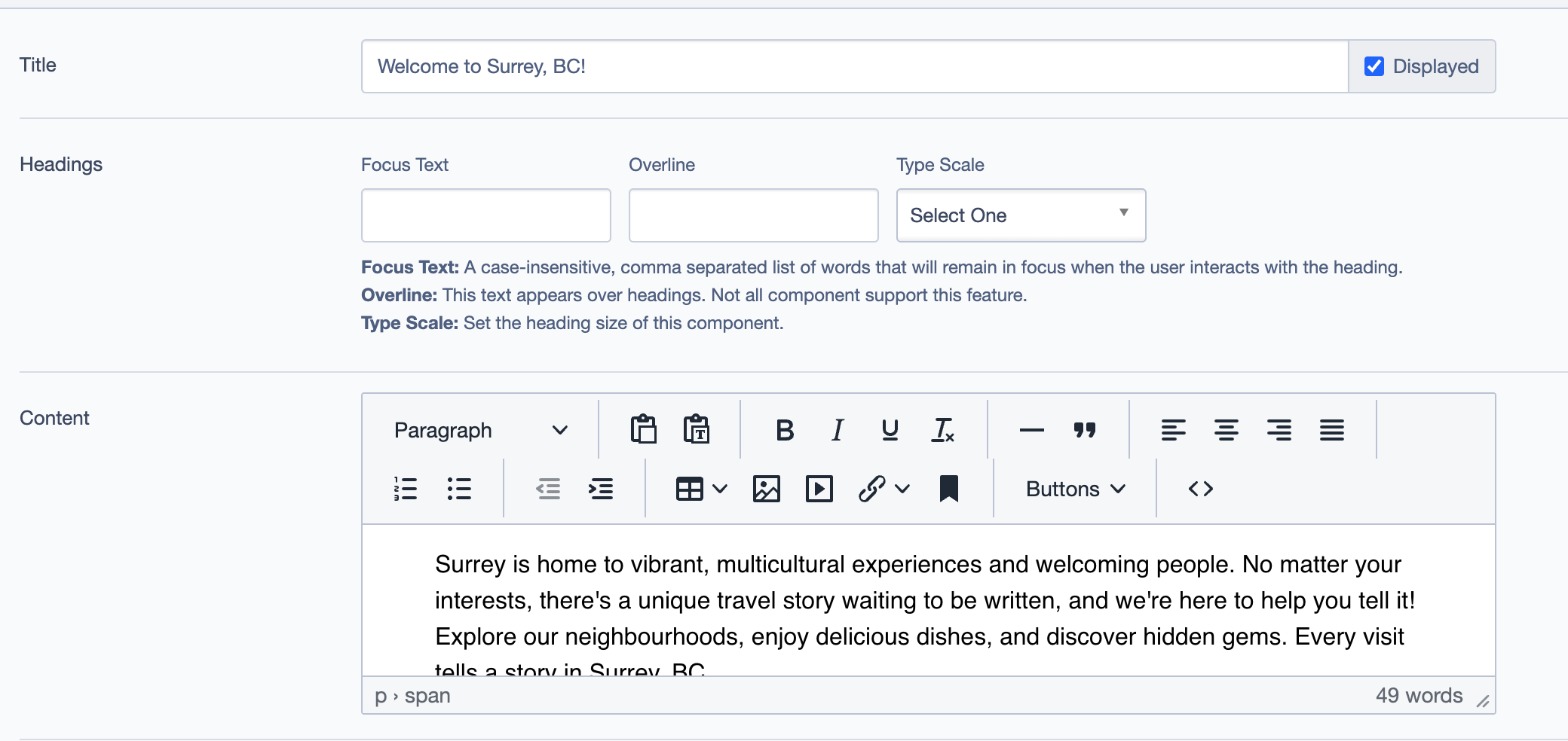
Title: Set the main title of the callout, e.g., "Welcome to Surrey, BC!" This serves as the primary heading for the block and should be engaging and clear.
Headings:
- Focus Text: (Optional) A comma-separated list of keywords that remain in focus when users interact with the heading.
- Overline: A smaller text that appears above the main title, providing additional context or a label.
- Type Scale: Choose a heading size for visual hierarchy.
Content:
- Enter descriptive text to appear below the title. This text should convey the message or purpose of the callout, such as a brief introduction or key details. For example:
"Surrey is home to vibrant, multicultural experiences and welcoming people. No matter your interests, there's a unique travel story waiting to be explored."
- Enter descriptive text to appear below the title. This text should convey the message or purpose of the callout, such as a brief introduction or key details. For example:
Layout
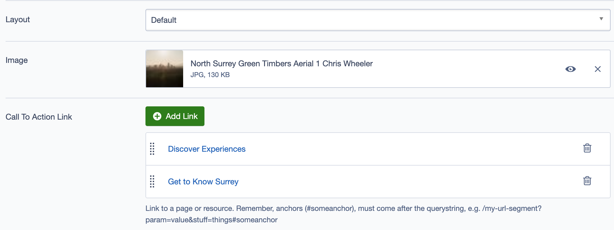
Layout: Choose from available layout options to control the positioning of text and images.
Image:
- Upload or select an image that represents the content. For example, an aerial image of North Surrey’s Green Timbers forest could visually support the welcoming message.
Call to Action Links
Add Link:
- Include call-to-action (CTA) links to direct users to related content. For example:
- Discover Experiences
- Get to Know Surrey
- Customize the link text, URL, and behavior (e.g., opening in a new tab) to enhance navigation and engagement.
- Include call-to-action (CTA) links to direct users to related content. For example:
Additional Settings
Display Options
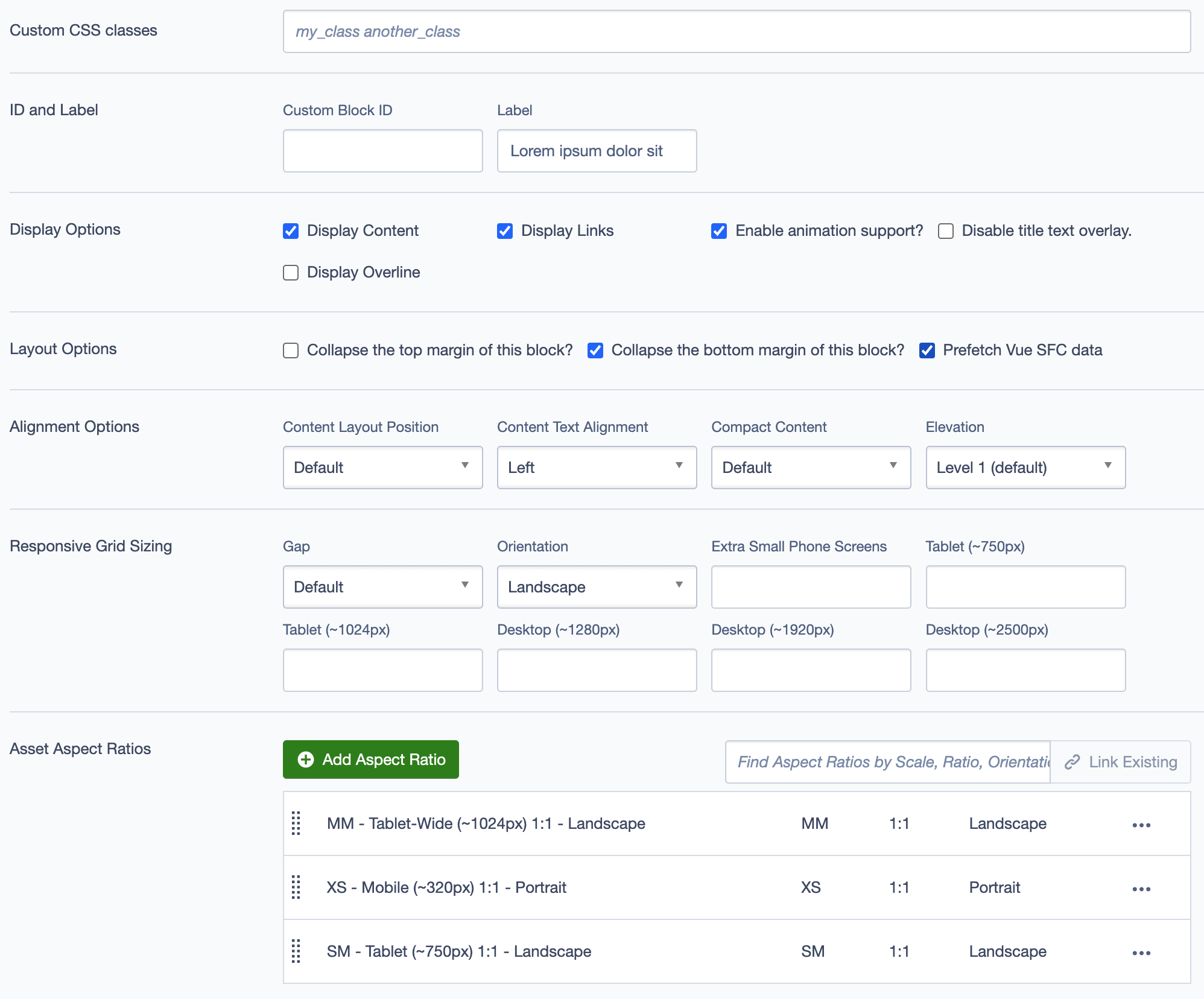
- Custom CSS Classes: Add custom CSS classes for additional styling.
- ID and Label:
- Custom Block ID: Assign a unique identifier for custom styling or scripts.
- Label: Add a recognizable label, e.g.,
Welcome Message, for internal reference.
- Display Options:
- Display Content: Toggle to show or hide content.
- Display Links: Toggle to show or hide the call-to-action links.
- Enable Animation Support: Enable animations for enhanced visual interaction.
- Disable Title Text Overlay: Remove overlay if it obstructs the title text.
- Display Overline: Show or hide the overline text above the main heading.
Layout Options
- Collapse Top/Bottom Margins: Option to collapse margins for a more compact layout.
- Prefetch Vue SFC Data: Prefetch data for Vue single-file components to improve loading speed.
Alignment Options
- Content Layout Position: Set the overall layout position of the content.
- Content Text Alignment: Adjust the alignment of the text within the block (e.g., Left, Center).
- Compact Content: Toggle compact content layout for tighter spacing.
- Elevation: Set the shadow depth to control the emphasis and layering effect (e.g., Level 1).
Responsive Grid Sizing
Define the grid settings for responsive layouts:
- Gap: Adjust the gap between elements.
- Orientation: Select portrait or landscape orientation.
- Extra Small Phone Screens: Specify grid behavior for small screens.
- Tablet and Desktop: Define column counts and spacing for tablet and desktop views.
Asset Aspect Ratios
Add Aspect Ratio: Define aspect ratios to maintain visual consistency across devices, such as:
- SM - Tablet (~750px) 1:1 - Landscape
- MM - Tablet-Wide (~1024px) 1:1 - Landscape
- XS - Mobile (~320px) 1:1 - Portrait
Custom Inline Styles
- Add Elemental Style Property: Add custom inline styles for further customization.
Inline Style Block
- Add custom CSS directly within the block to override or add specific styles.
Best Practices
- Use this block to emphasize content that should stand out on the page, like a welcome message or key information.
- Ensure the title is clear and relevant to capture user interest.
- Pair the text with high-quality, relevant imagery to enhance visual appeal.
- Include call-to-action links to direct users to other sections or resources.
Example Use Case
- Welcome Message: Use the
Calloutblock on a homepage to welcome visitors with a brief introduction and engaging visuals. Pair this with relevant call-to-action links, such as "Discover Experiences" or "Get to Know Surrey," to encourage users to explore further.
Here are example screenshots showing the Callout block in use: