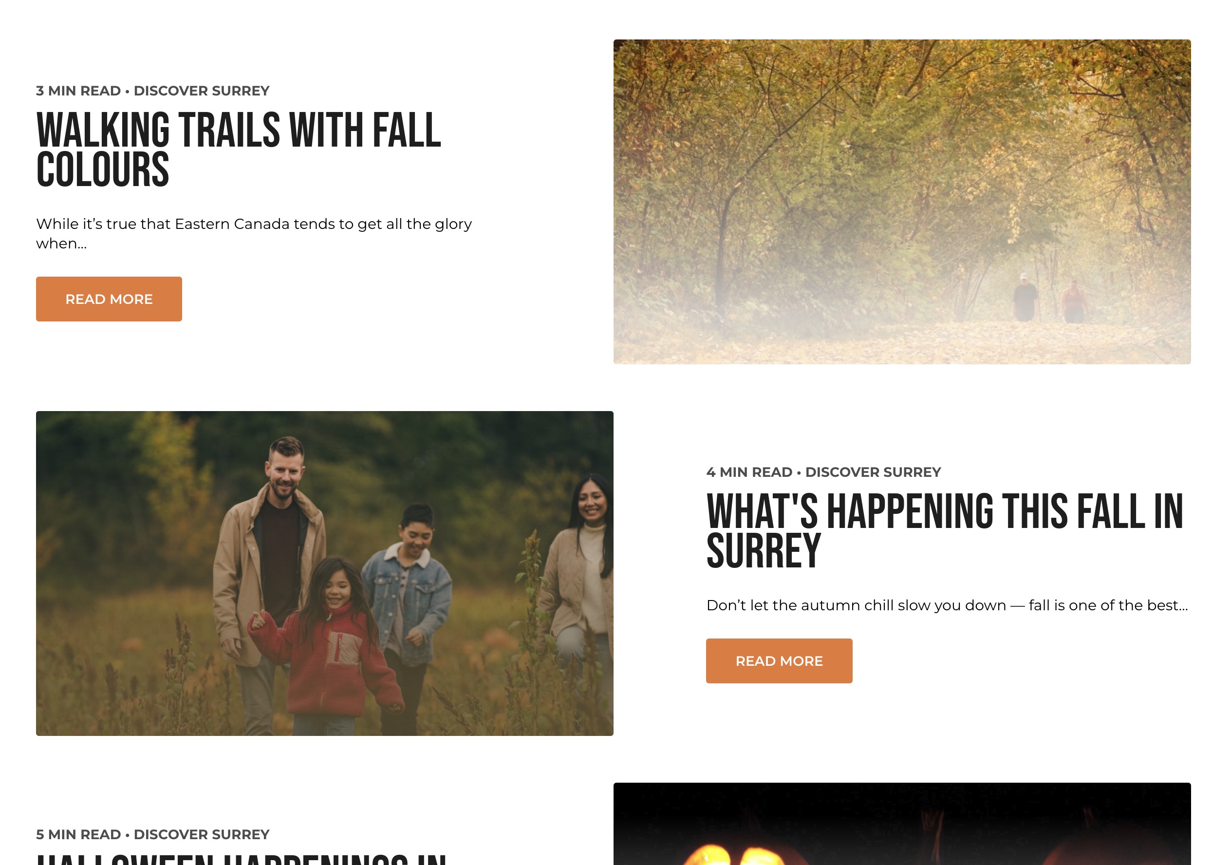
Stories List Block
The Stories List Block is used to showcase a list of stories, typically in a grid format. Each story card includes a title, summary, read time, and a featured image, making it easy for users to explore multiple stories at a glance.
Block Configuration
Title
- Field: The title of the block as displayed on the page.
- Example:
Stories
Headings
- Focus Text: A comma-separated list of keywords for focus.
- Overline: Text displayed above the main heading.
- Type Scale: Select the heading size.
Content
- Content Editor: Add or edit introductory content for the block.
- Example:
Explore our latest stories and articles.
Call to Action Link
- Add Link: Option to add a link with a call-to-action (e.g., "Read More").
Settings
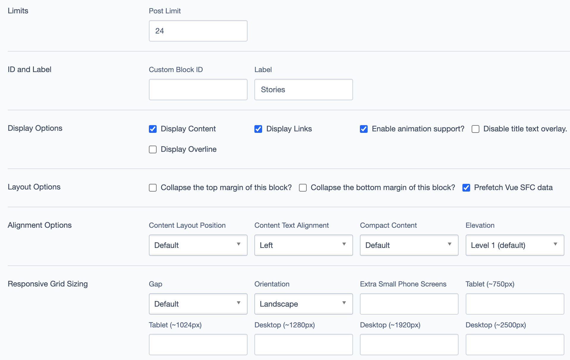
ID and Label
- Custom Block ID: Assign a unique identifier to the block.
- Label: Optional descriptive label for the block.
Display Options
- Display Content: Toggle to show or hide content within the block.
- Display Links: Toggle to show or hide links.
- Enable Animation Support: Toggle animations for visual effects.
- Display Overline: Toggle to display or hide the overline text.
Layout Options
- Collapse Top Margin: Toggle to collapse the top margin of the block.
- Collapse Bottom Margin: Toggle to collapse the bottom margin of the block.
- Prefetch Vue SFC Data: Preload data for Vue Single-File Components for faster load times.
Alignment Options
- Content Layout Position: Position content within the block (e.g.,
Center,Left). - Content Text Alignment: Align text content within the block (e.g.,
Left,Center). - Compact Content: Adjust content density within the block.
- Elevation: Adjust block elevation for shadow effects (e.g.,
Level 1 (default)).
Responsive Grid Sizing
- Gap: Set the gap between items in the grid.
- Orientation: Set layout orientation (e.g.,
Landscape). - Device-Specific Layout: Configure layout for various screen sizes:
- Extra Small Phone Screens
- Tablet
- Desktop
Asset Aspect Ratios
- Define aspect ratios for different screen sizes (e.g., XS - Mobile, SM - Tablet, MM - Tablet-Wide).
Custom CSS Classes
- Field: Add any custom CSS classes.
Custom Inline Styles
- Add Elemental Style Property: Option to add inline styles directly to the block.
Inline Style Block
- Add additional inline styles or JavaScript code.
Virtual Lookup Title
- Automatically Generated: Used for linking or referencing this block within the CMS. Example:
Stories (Stories List #48761)
Example Use Cases
- Blog Highlights: Display a selection of recent blog posts to engage readers.
- Event Summaries: Use for showcasing summaries of recent events or activities.
- Featured Articles: Highlight popular articles for easy access.
Visual Examples