Experience Block
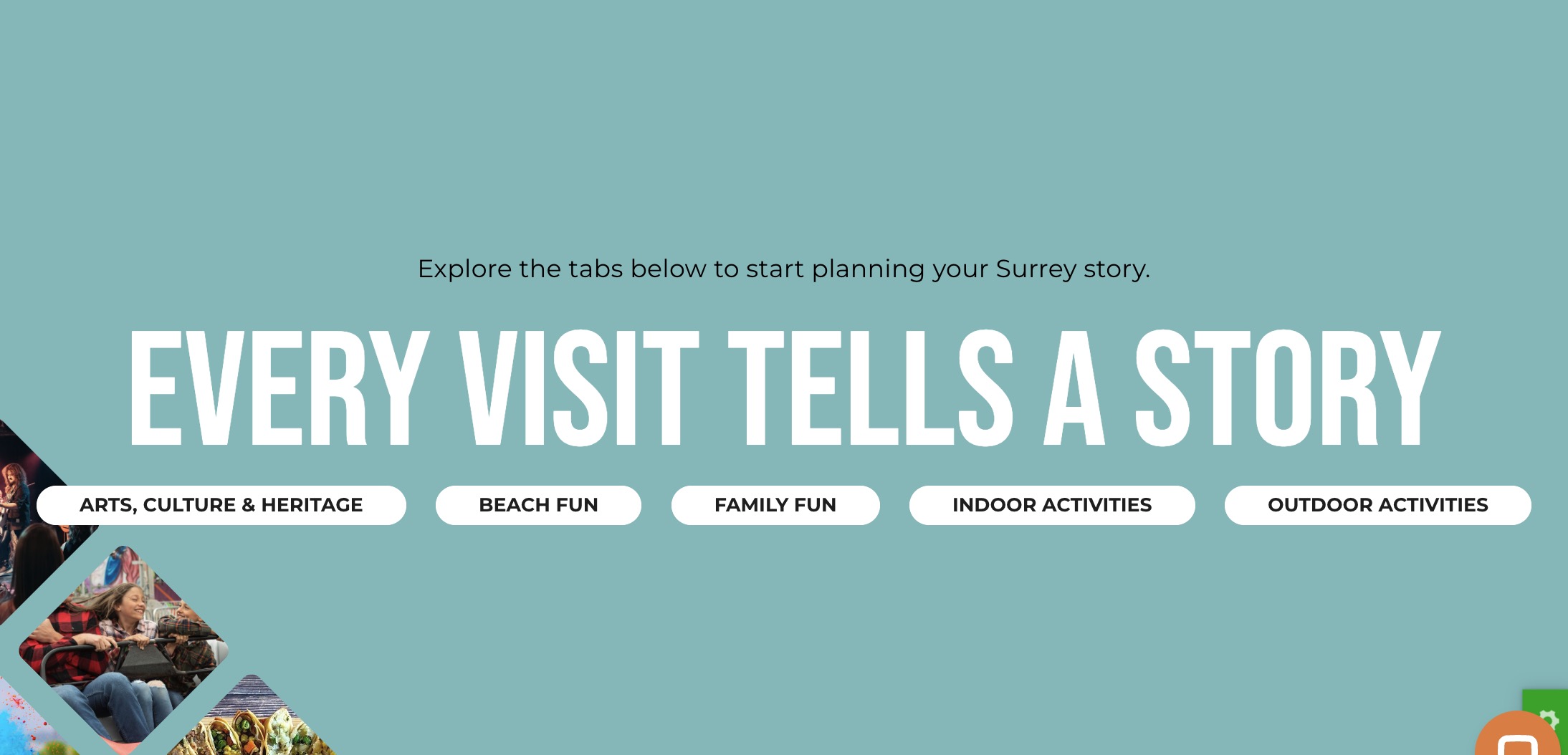
The Experience Block is designed to showcase various activities and experiences available in Surrey. This block encourages visitors to explore Surrey by displaying themed images and categories in a visually engaging way.
Block Configuration
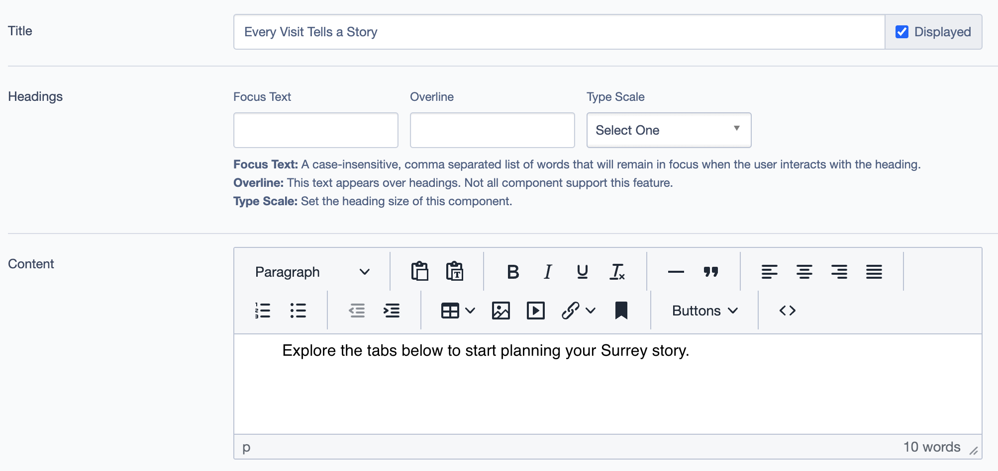
Title
- Title: Set the main title for the block
- Description: Sets the main heading for the block, displayed prominently at the top.
- Example: "Every Visit Tells a Story"
Headings
- Focus Text: A comma-separated list of words that stay in focus when the user interacts with the heading.
- Overline: Text that appears above headings. (Note: Not all components support this feature.)
- Type Scale: Defines the heading size.
Content
- Field:
Content - Description: Allows you to provide a description or introductory text for the block.
- Example: "Explore the tabs below to start planning your Surrey story."
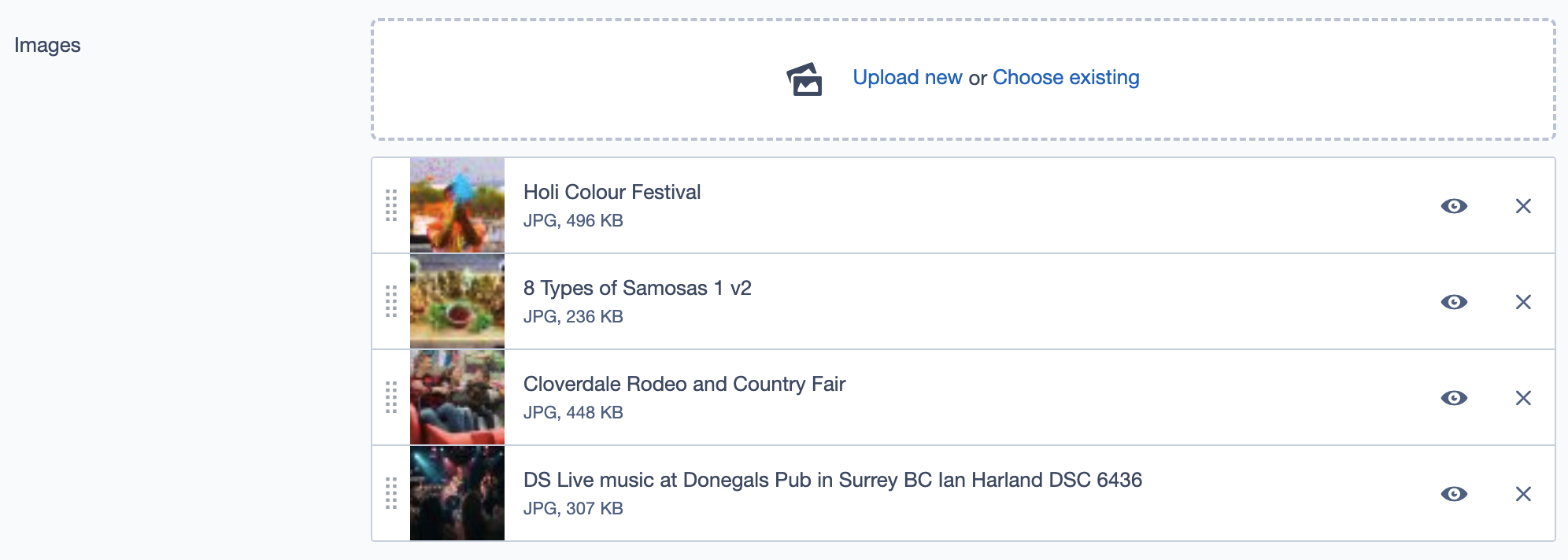
Images
- Field:
Images - Description: Add images that represent various experiences in Surrey. Images are displayed alongside the terms and contribute to the visual appeal of the block.
- Example Images:
- Holi Colour Festival
- 8 Types of Samosas
- Cloverdale Rodeo and Country Fair
Terms
- Dropdown Menu for Terms: The Terms field allows you to categorize the experiences displayed in this block.
- Click on the Terms field to open a dropdown with various categories like "Arts, Culture & Heritage," "Beach Fun," "Family Fun," "Indoor Activities," and "Outdoor Activities."
- Select multiple terms to tag the experiences with relevant themes, helping users find activities based on their interests.
- Clickable Tags: Selected terms will appear as clickable tags on the user interface. When a user clicks on a tag, it will take them to a related page, providing further information and a comprehensive list of activities under that specific theme.
Call to Action Link
- Field:
Call to Action Link - Description: A clickable link for users to explore more experiences.
- Example Label: "See All Experiences"
- Usage: This link typically redirects users to a page with a broader list of experiences or activities.
Settings Tab
Custom CSS Classes
- Field:
Custom CSS Classes - Description: Add custom CSS class names to style the block uniquely.
- Example:
my_class another_class
ID and Label
- Custom Block ID: Optional ID for the block.
- Label: Optional text label for internal use.
Display Options
- Options:
- Display Content: Show or hide content text.
- Display Links: Show or hide the link section.
- Enable Animation Support: Adds animations if supported.
- Disable Title Text Overlay: Disables overlay on title text.
- Display Overline: Show the overline text if applicable.
Layout Options
- Collapse Top/Bottom Margins: Toggles the top and bottom margin visibility for the block.
- Prefetch Vue SFC Data: Preloads Single File Components data.
Alignment Options
- Content Layout Position: Adjusts the layout positioning (e.g., Default).
- Content Text Alignment: Sets text alignment (e.g., Left).
- Compact Content: Reduces padding for compact view.
- Elevation: Sets elevation levels for shadow effects (e.g., Level 1).
Responsive Grid Sizing
- Options:
- Gap: Controls spacing between grid elements.
- Orientation: Landscape or Portrait mode.
- Extra Small Phone Screens/Tablets/Desktop: Define grid properties based on screen sizes.
Asset Aspect Ratios
- Field:
Asset Aspect Ratios - Description: Define aspect ratios for various screen sizes.
- Example Ratios:
- Tablet-Wide (~1024px) -
2:1 Landscape - Tablet (~750px) -
1:1 Landscape
- Tablet-Wide (~1024px) -
Inline Styles
- Custom Inline Styles: Option to add custom inline CSS properties.
- Inline Style Block: Add global inline style properties here if necessary.
Example Usage
Experience Block on Homepage: