Taxonomy Map Block
Description
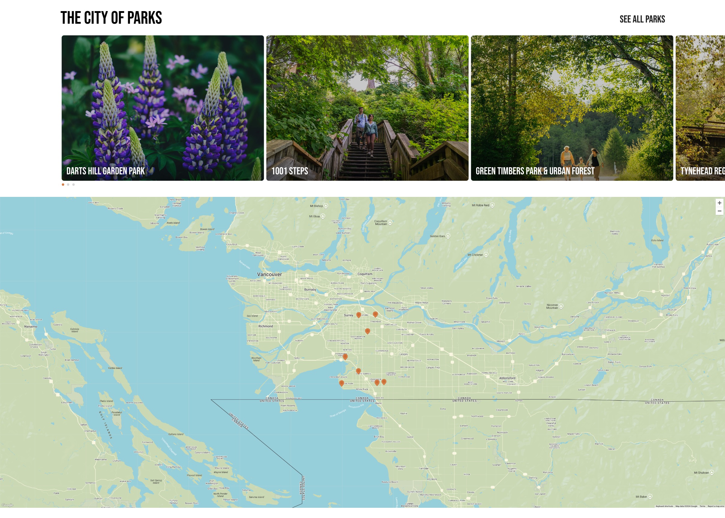
The Taxonomy Map Block displays a visual map and image gallery related to specific categories or themes. It is ideal for showcasing locations, parks, or other points of interest on an interactive map.
Block Configuration
Title
- Field: The title of the block as displayed on the page.
- Example:
The City of Parks
Headings
- Focus Text: Comma-separated keywords for enhanced focus.
- Overline: Text displayed above the main title.
- Type Scale: Adjusts the heading size for consistency across the site.
Content
- Content Editor: Allows adding or editing the description for this block.
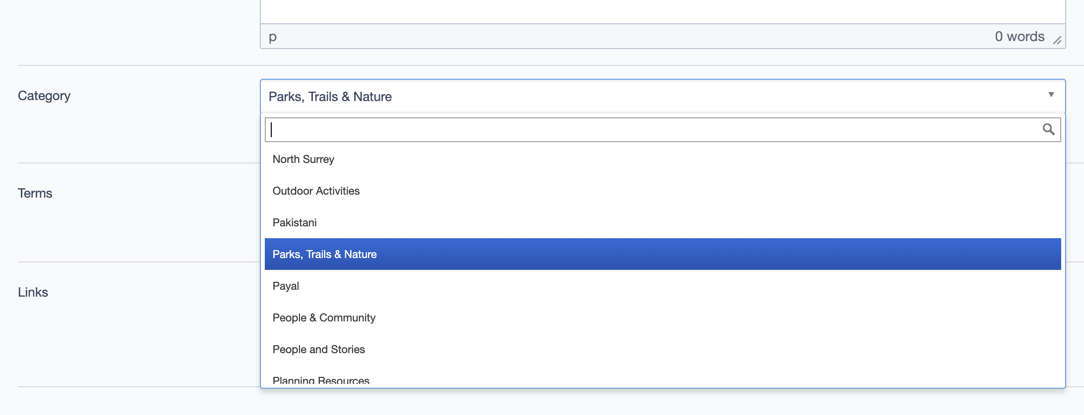
- Category: Select a primary category (term) to define the content type.
- Example:
Parks, Trails & Nature - Note: Changing the Category will update the items displayed in the slider and on the map to reflect content related to the selected category.
- Example:
- Terms: Choose secondary categories (terms) that relate to the content displayed.
- Links: Add a link button, such as a "See All Parks" link for further navigation.
 Category dropdown allows selection of a primary category. Changing the category will dynamically update the slider and map on the frontend to display relevant items.
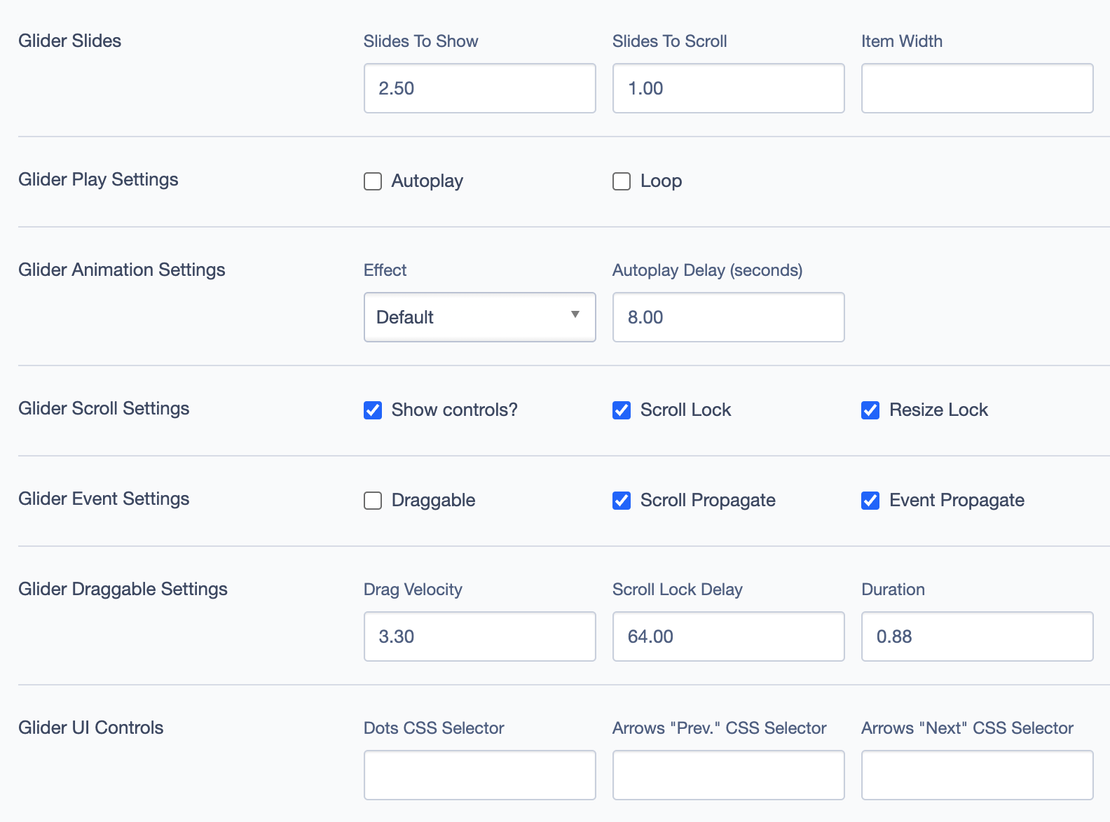
Glider Settings
The Glider Settings section configures the sliding image gallery above the map.
- Slides to Show: Number of slides visible at a time.
- Example:
2.50
- Example:
- Slides to Scroll: Number of slides that scroll at once.
- Item Width: Sets the width of each item in the slider.
- Glider Play Settings: Toggle Autoplay and Loop options.
- Glider Animation Settings: Configure animation effects and delay.
- Effect: Choose from different animation styles, e.g.,
Default. - Autoplay Delay: Sets delay in seconds for autoplay, e.g.,
8.00.
- Effect: Choose from different animation styles, e.g.,
- Glider Scroll Settings: Adjust scroll behaviors:
- Show Controls: Toggle control buttons.
- Scroll Lock: Locks scroll when interacting with slides.
- Resize Lock: Prevents resizing during scroll.
- Glider Event Settings: Control events like dragging and scrolling.
- Glider Draggable Settings: Set drag velocity and duration for a smooth experience.
- Glider UI Controls: Customize controls via CSS selectors if needed.
Settings
Custom CSS Classes
- Field: Add any custom CSS classes for unique styling.
Render Options
- Limit: Specify the maximum number of items displayed.
- Example:
9
- Example:
ID and Label
- Custom Block ID: Unique identifier for targeting.
- Label: Descriptive label for easy identification.
Display Options
- Display Content: Show or hide content within the block.
- Display Links: Toggle links within the block.
- Enable Animation Support: Add animations to the block.
- Disable Title Text Overlay: Prevents overlay effects on the title.
- Display Overline: Show the overline above the title.
Layout Options
- Collapse Top Margin: Adjusts spacing above the block.
- Collapse Bottom Margin: Adjusts spacing below the block.
- Prefetch Vue SFC Data: Optimizes data fetching for Vue Single-File Components.
Alignment Options
- Content Layout Position: Choose where the content aligns within the block.
- Options:
Default,Top, etc.
- Options:
- Content Text Alignment: Adjusts text alignment within the content area.
- Options:
Left,Center, etc.
- Options:
- Compact Content: Controls the density of content.
- Elevation: Adjust the block elevation for depth and shadow effects.
Responsive Grid Sizing
- Gap: Controls spacing between items.
- Orientation: Set the layout orientation (e.g.,
Landscape). - Extra Small Phone Screens, Tablet, Desktop: Customize layout for different screen sizes.
Asset Aspect Ratios
- Allows custom aspect ratios for various devices.
Inline Style Block
- Field: Add custom inline CSS styles specific to this block.
Virtual Lookup Title
- Field: Unique lookup title for linking purposes.
Custom Inline Styles
- Add Elemental Style Property: Define custom inline styles if needed.
Best Practices
- Limit the Number of Terms: Too many terms can clutter the map. Choose relevant terms that enhance user experience.
- Optimize Aspect Ratios: Ensure images in the slider are consistent for a clean, professional appearance.
- Leverage Categories: Use clear categories that help users filter and navigate content intuitively.
Example Use Case
The Taxonomy Map Block is ideal for displaying geographical or categorized content, with an interactive map and image carousel. Users can view related locations and click on individual parks for more information.