Mosaic Block
The Mosaic block creates a visually engaging category grid, allowing users to explore different content tiles in a mosaic format. Ideal for showcasing categories, themes, or types of content on a single block, it enhances user engagement and provides easy navigation. It can be used as an interactive "Explore" or "Category Overview" section, with customizable tiles that include titles, focus text, and links to other sections or pages.
Settings
Content Settings
- Title: Enter the title for the mosaic grid, e.g., "Explore - Category Grid".
- Headings:
- Focus Text: A comma-separated list of keywords to remain in focus when users interact with the heading.
- Overline: A smaller line of text that appears above the main heading.
- Type Scale: Choose the heading size from available options.
- Content: Use the rich text editor to add introductory content or description related to the mosaic grid.
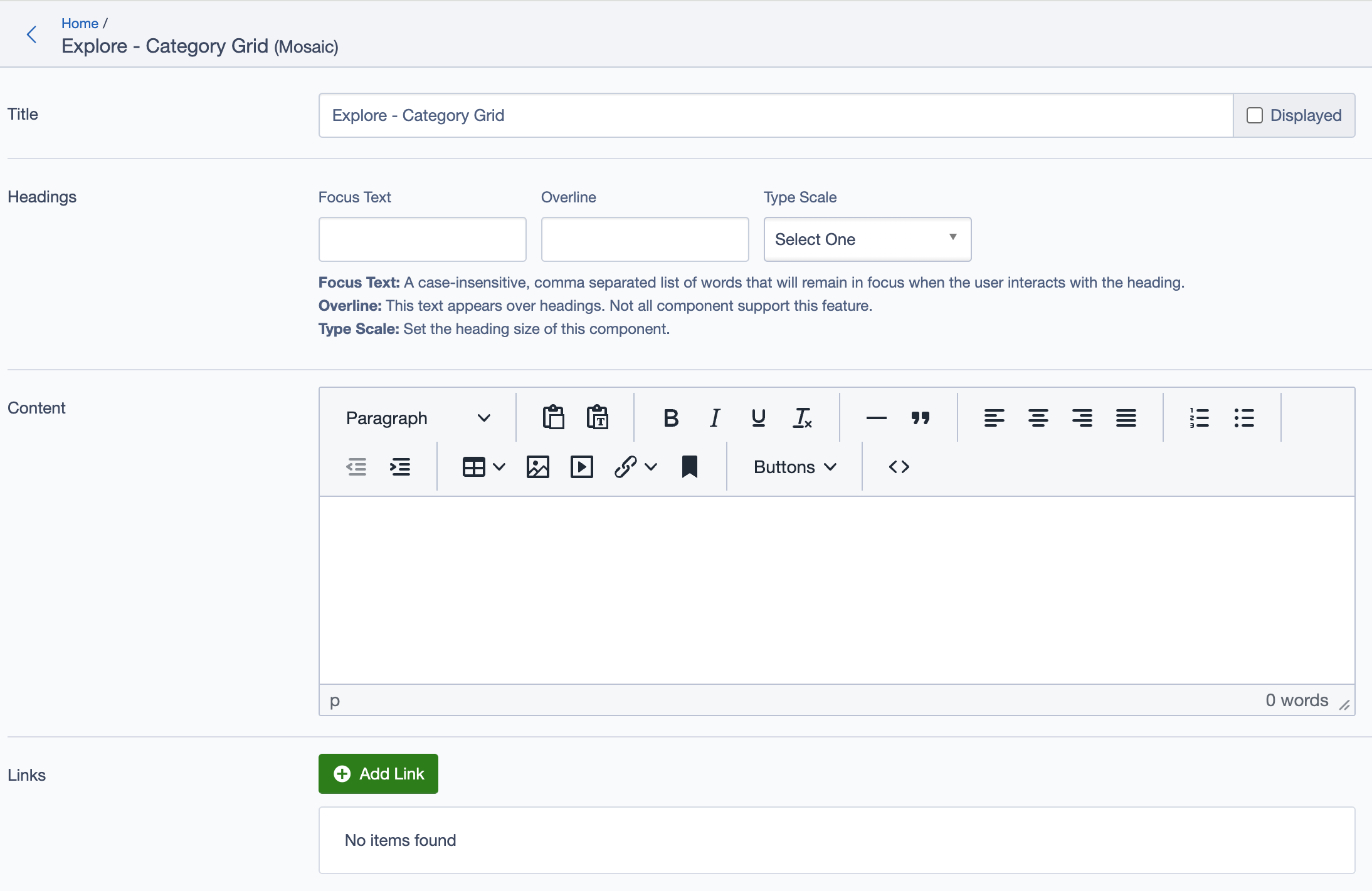
Links
- Add Link: Add call-to-action links if needed for navigation or additional information.
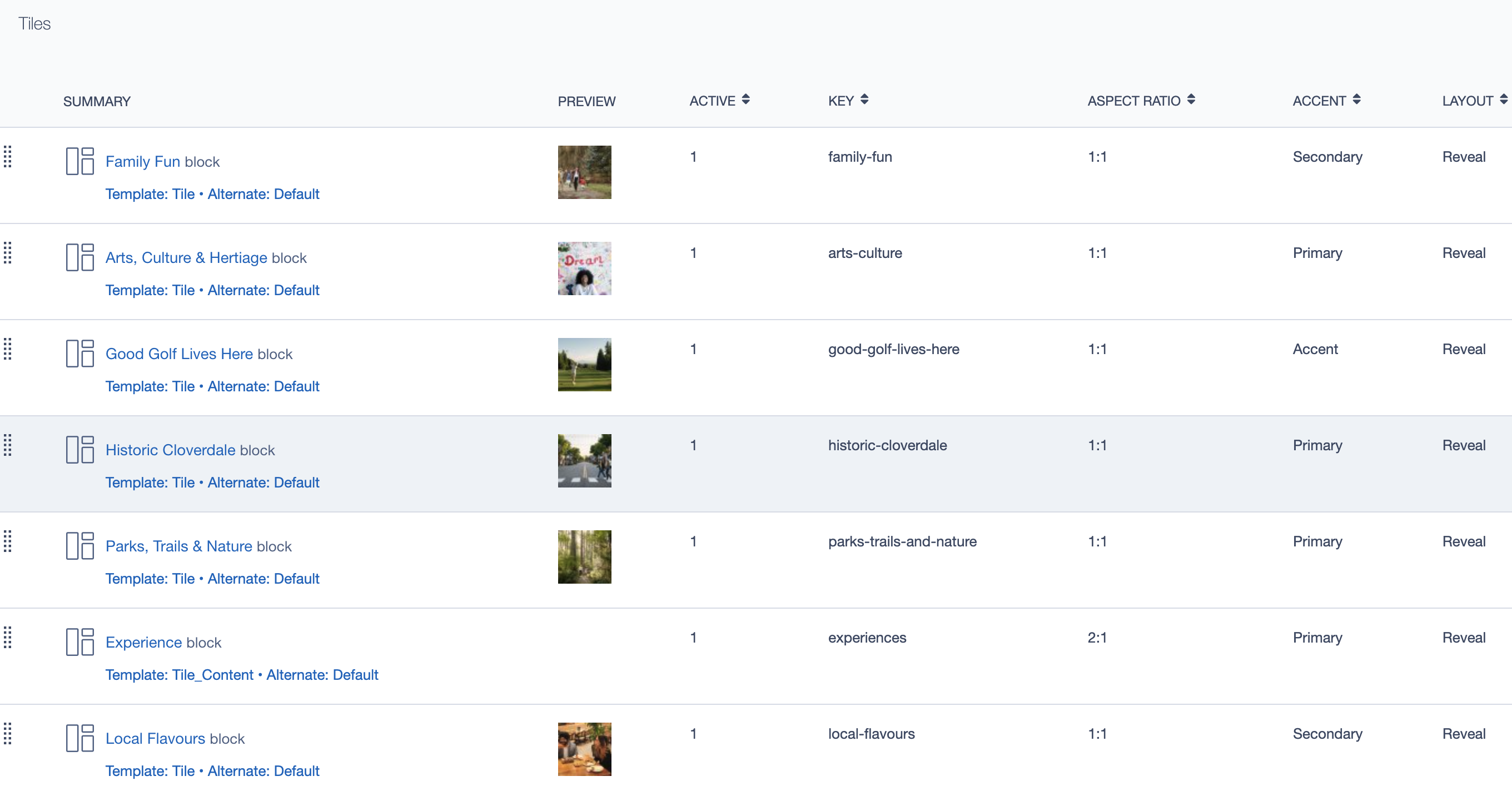
Blocks (Tiles)
- Add Block: Click to add a new block (tile) to the mosaic grid. Each block may represent a specific category or content group, including:
- Summary: Provides a preview of the content.
- Key: Unique identifier for each tile.
- Aspect Ratio: Defines the tile's aspect ratio (e.g., 1:1, 2:1).
- Accent: Set the accent type (e.g., Primary, Secondary).
- Layout: Select the layout style for the tile (e.g., Reveal).
Adding a Block to the Mosaic
To add a new tile within the Mosaic block, follow these steps:
- Click on Add Block under the "Tiles" section within the Mosaic block settings.
- Configure the newly added block with relevant content and settings. Each block within the mosaic can be customized with specific titles, images, layouts, and links.
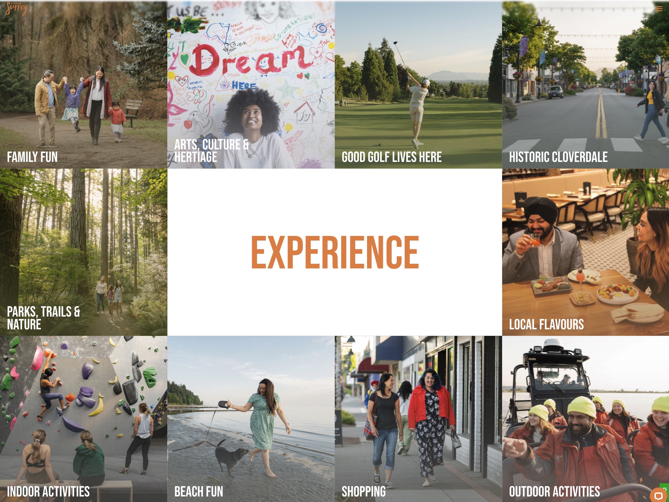
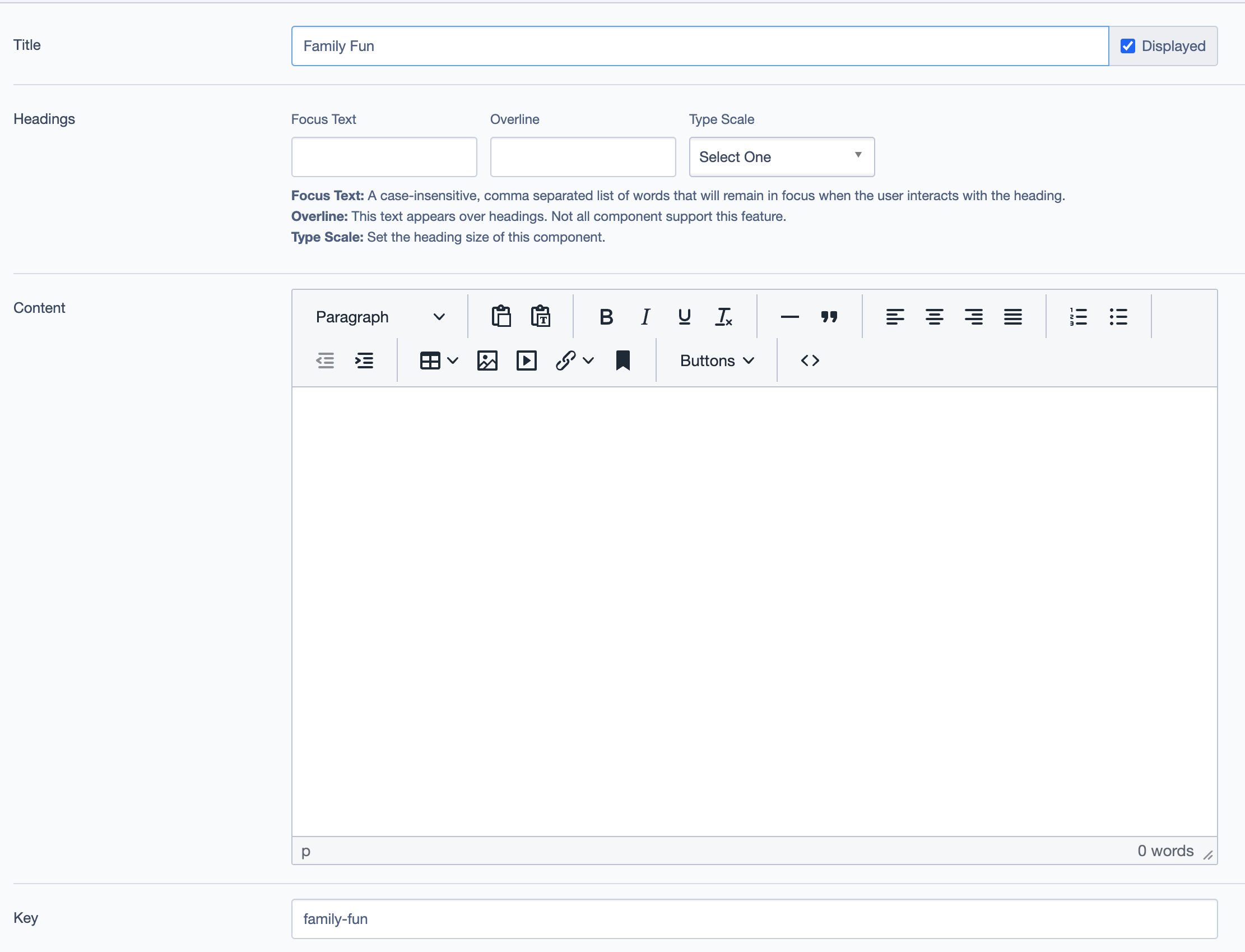
Example Tile: Family Fun
The Family Fun tile is one of the individual blocks added to the Mosaic block. This tile provides a way to highlight family-oriented activities, using visual and text-based content to engage users and direct them to more information.
Settings for the Family Fun Tile
Title:
Family Fun- This is the main heading for the tile, displaying the category name prominently on the grid.
Headings:
- Focus Text: (Optional) Keywords that stay in focus, enhancing user engagement when interacting with the heading.
- Overline: Additional smaller text above the main heading, providing contextual information or a brief description.
- Type Scale: Select the heading size for the tile title.
Key:
family-fun- This is a unique identifier for the "Family Fun" tile. It helps in managing and referencing individual tiles within the mosaic layout.
Display Options:
- Display this tile: Toggle to show or hide the tile on the front end.
Image:
- Upload an image representing the "Family Fun" category. For example, a family enjoying a day outdoors can visually convey the theme of this tile.
- The image adds visual appeal and helps users quickly identify the tile’s theme.
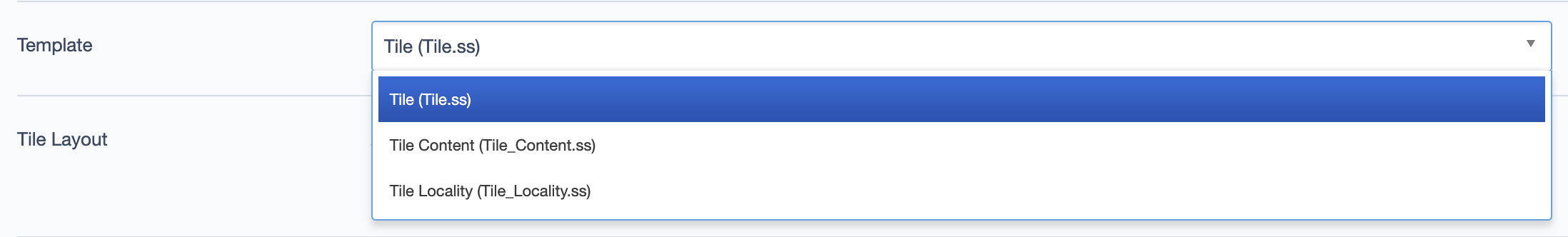
Template:
- Choose a template for the tile's display. Options might include
Tile (Tile.ss),Tile Content (Tile_Content.ss), orTile Locality (Tile_Locality.ss), each offering a different layout or visual style for the tile.
- Choose a template for the tile's display. Options might include
Tile Layout:
- Alternate: Select the layout variation for this tile.
- Aspect Ratio: Define the image aspect ratio (e.g., 1:1, 2:1) to maintain consistency across the mosaic.
- Layout: Set the tile’s display style, such as
Reveal, to control how the tile interacts visually within the mosaic. - Accent: Choose an accent style (e.g., Primary, Secondary) to highlight or categorize the tile further.
Call to Action Link:
- Add a Call to Action (CTA) link for the tile, such as a "Learn More" button that directs users to a detailed page on family-friendly activities.
- Customize the link text, destination URL, and other settings to create a smooth navigation experience for users exploring this category.
Linked To
Displays the other pages where this mosaic block is being used.
Additional Settings
Layout & Display Options
- Custom CSS Classes: Add custom CSS classes for styling.
- ID and Label:
- Custom Block ID: Unique identifier for custom configurations.
- Label: Provides a recognizable label, e.g.,
homepage experience.
- Display Options:
- Enable or disable options such as "Display Content," "Display Links," and "Enable Animation Support."
- Display Overline: Choose whether to display an overline for additional emphasis.
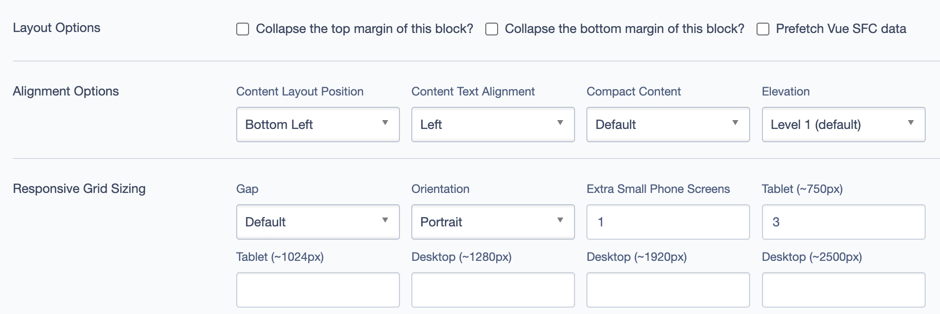
- Layout Options:
- Collapse Top/Bottom Margins: Set to collapse margins if needed.
- Prefetch Vue SFC Data: Enable this option to improve loading performance for Vue single-file components.
Alignment Options
- Content Layout Position: Controls the overall position of the mosaic content.
- Content Text Alignment: Adjust text alignment within the block.
- Compact Content: Toggle for compacting content within the block if necessary.
- Elevation: Choose the elevation (shadow depth) for the block (e.g., Level 3).
Responsive Grid Sizing
Controls how the mosaic layout adjusts to different screen sizes:
- Gap: Defines spacing between tiles.
- Orientation: Set portrait or landscape orientation for the tiles.
- Extra Small Phone Screens: Set the number of columns for extra small screens.
- Tablet and Desktop: Define specific settings for tablet and desktop layouts.
Asset Aspect Ratios
- Add and manage aspect ratios to ensure visual consistency across different screen sizes.
Custom Inline Styles
- Add Elemental Style Property: Add custom inline styles to further customize the block.
Inline Style Block
- Add custom CSS directly within the inline style block.
Virtual Lookup Title
- Virtual Lookup Title: Displays a reference name for internal linking, e.g.,
Explore - Category Grid (Mosaic #459).
Best Practices
- Use this block to group related content under distinct categories to help users navigate the site effectively.
- Ensure each block tile has a unique and descriptive key for easy reference.
- Select appropriate imagery for each tile to make the content visually appealing.
- Use consistent aspect ratios across all tiles to maintain a structured and neat layout.
Example Use Cases
- Explore Category Section: Use the
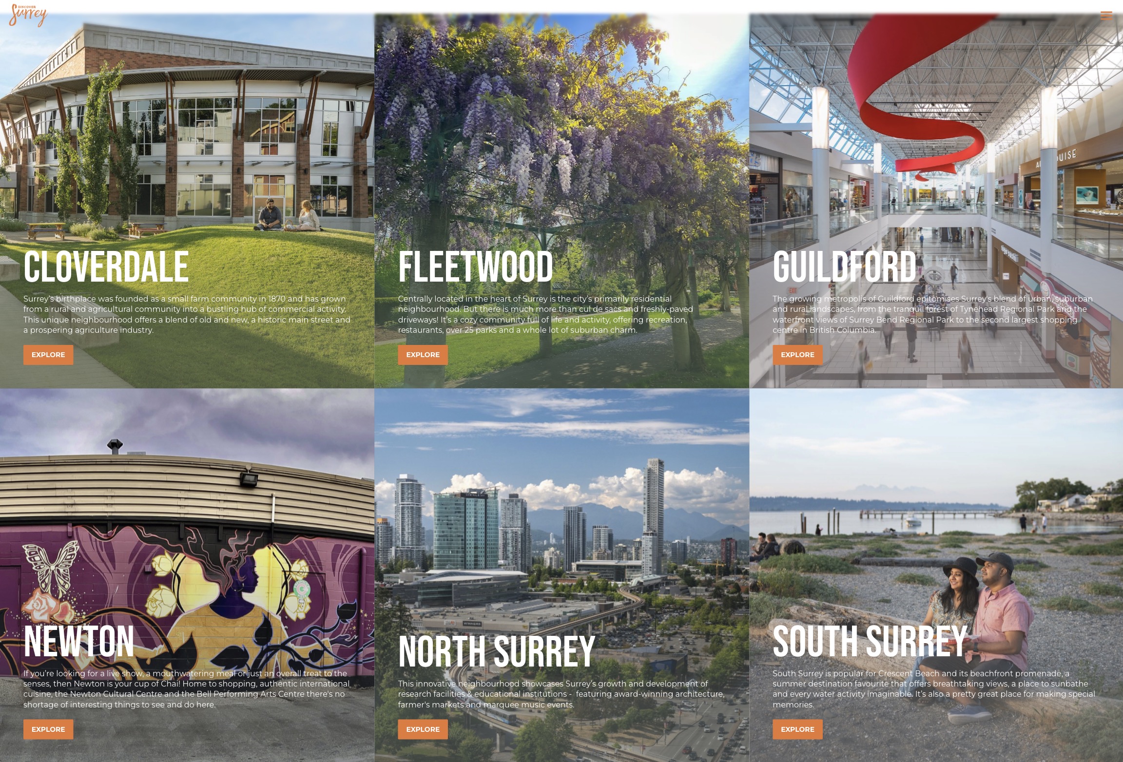
Mosaicblock to display a variety of categories for users to explore, such as "Family Fun," "Arts & Culture," "Parks & Nature," etc. Each category should have a visually distinct tile with appropriate images and descriptions to guide users to more in-depth content. - Experience Overview: Create an "Experience" page using this block to present different experiences available in a region, such as dining, outdoor activities, and local events, all grouped under the mosaic grid.
Here are example screenshots showing the Mosaic block in use: