Feature Map Block
The Feature Map Block is designed to display an interactive map with symbols representing various landmarks or points of interest. Users can add custom symbols with specific coordinates and styling, allowing visitors to explore major landmarks or important locations on a visual map.
Fields and Settings
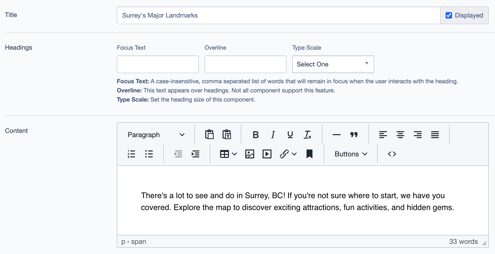
1. Title
- Field:
Title - Description: Sets the main title of the Feature Map Block.
- Example:
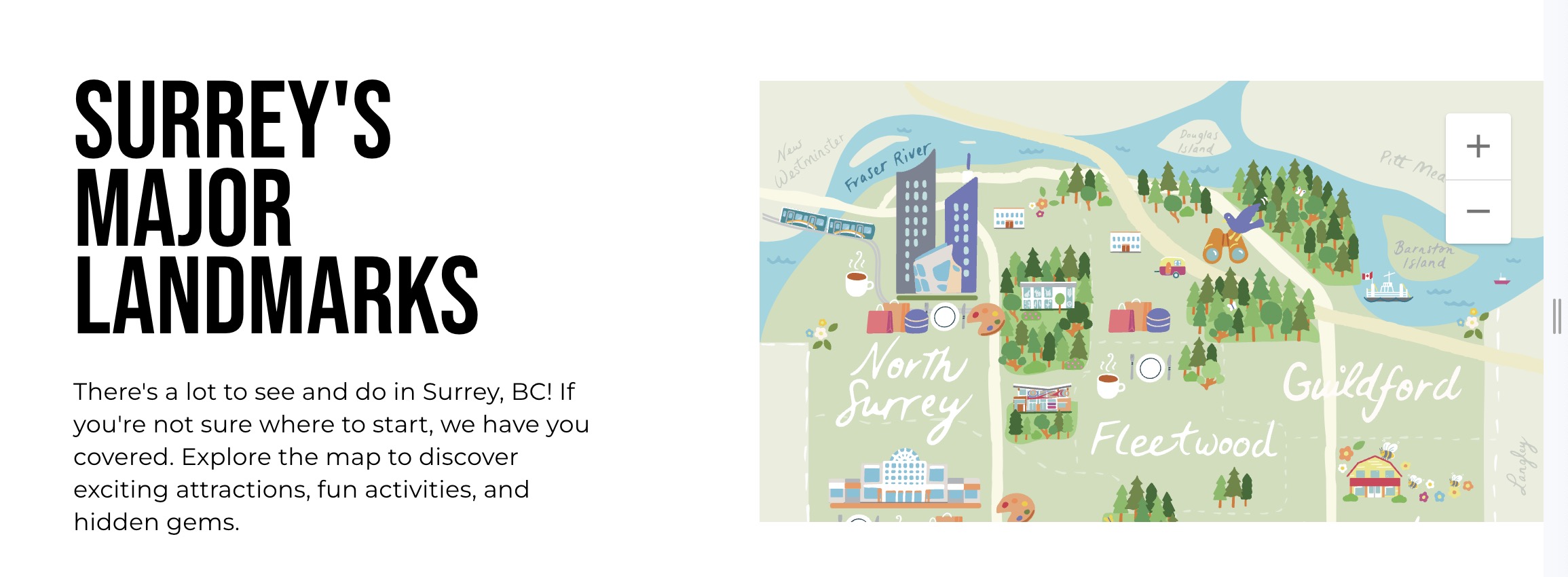
Surrey's Major Landmarks
2. Headings
- Focus Text: Keywords that remain highlighted when users interact with the heading.
- Overline: Displays additional text above the heading.
- Type Scale: Allows setting the size of the heading for different visual hierarchies.
3. Content
- Field:
Content - Description: Enter text to describe the map, providing context to viewers.
- Example:
Explore the map to discover exciting attractions, fun activities, and hidden gems.
4. Symbols
- Purpose: Adds interactive icons or symbols to the map, representing specific locations or points of interest.
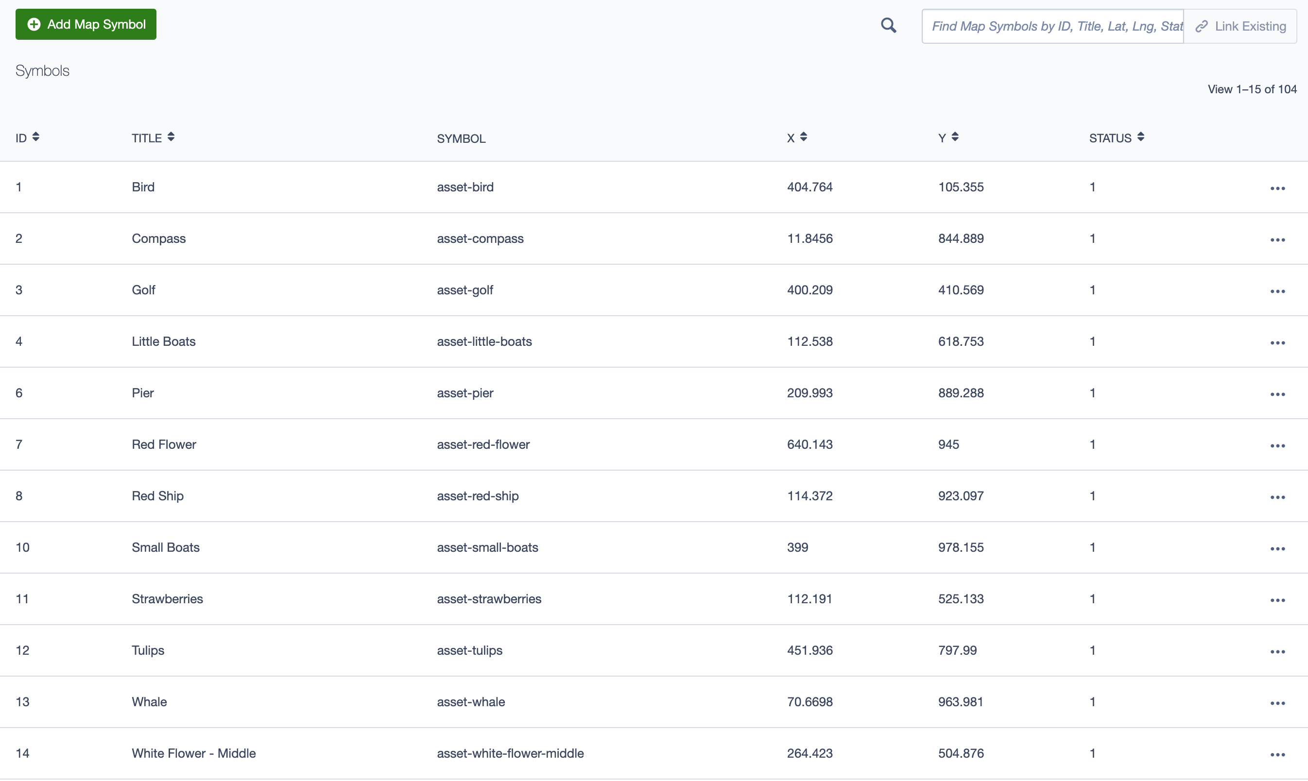
- Adding Symbols:
- Click on
Add Map Symbolto create a new symbol.
- Click on
- Fields for Symbols:
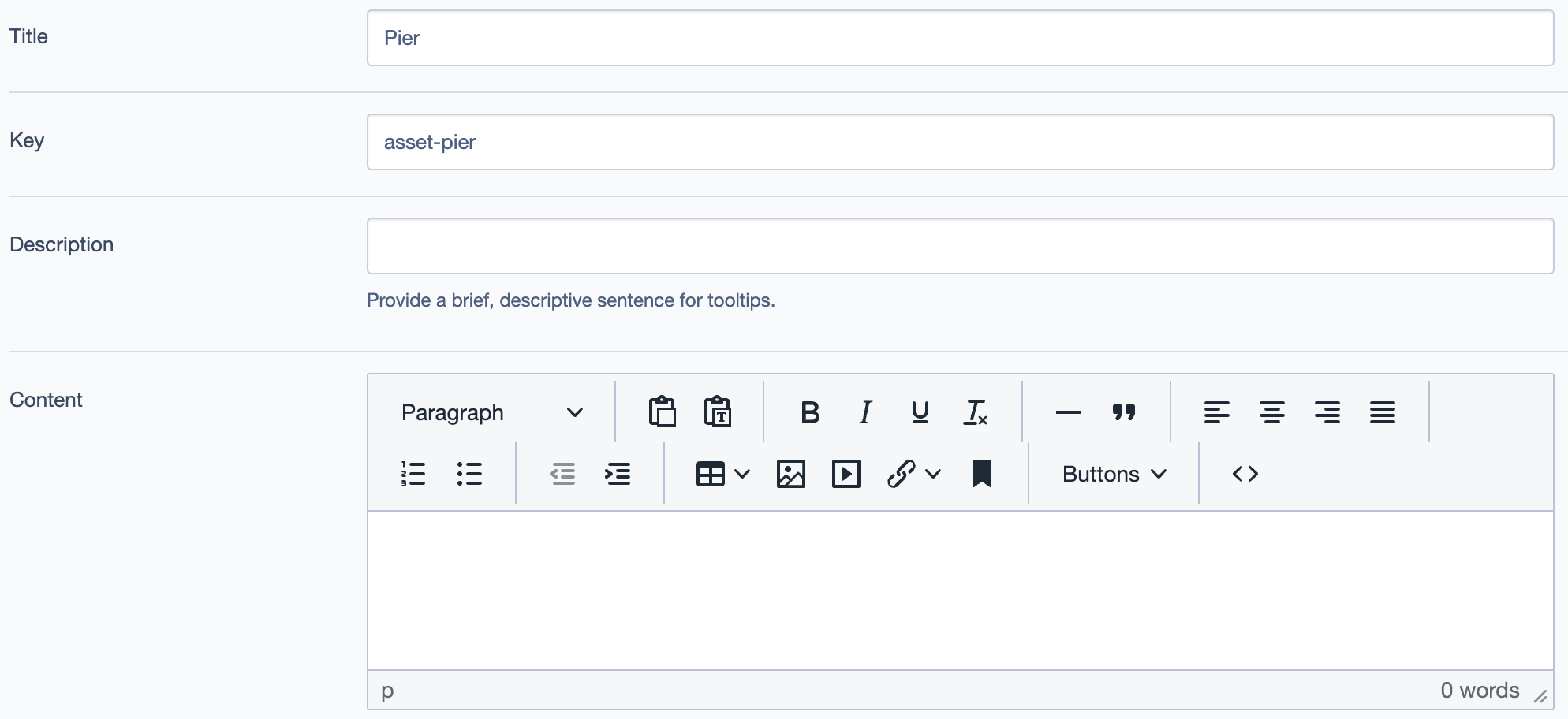
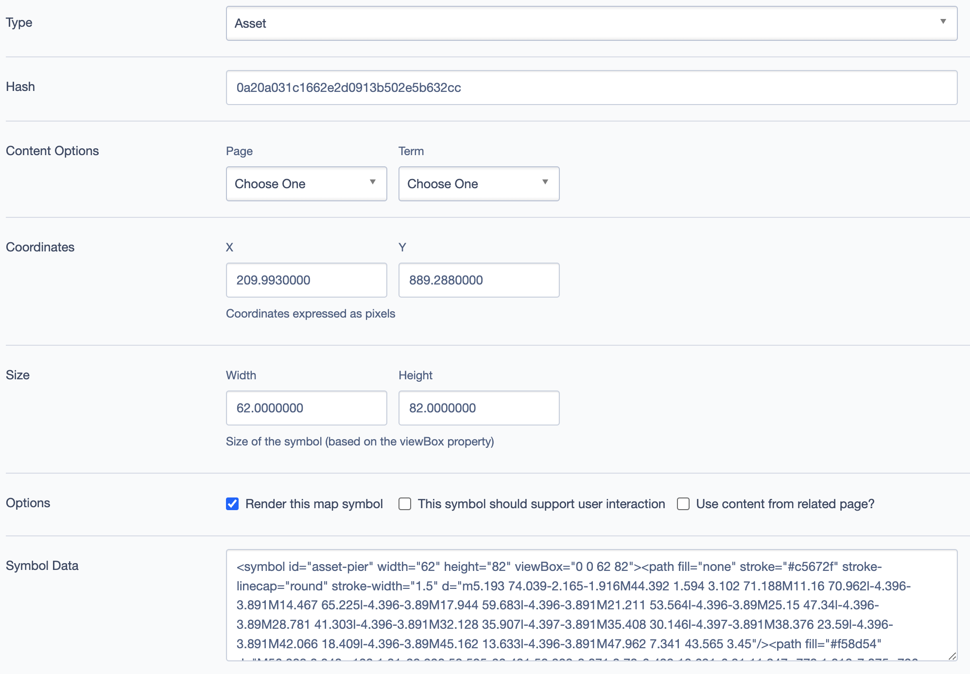
- Title: The name of the symbol (e.g.,
Pier,Red Ship). - Key: Unique identifier for the symbol.
- Description: Tooltip description that appears when users hover over the symbol.
- Content: Long-form content to provide detailed information about the symbol.
- Title: The name of the symbol (e.g.,
- Fields for Symbols settings:
- Coordinates (
X,Y): Specify the position of the symbol on the map in pixel values. - Size (
Width,Height): Set the size of the symbol based on the viewBox property. - Options:
- Render this map symbol: Toggle visibility of the symbol on the map.
- Support user interaction: Enable interactivity like click or hover effects.
- Use content from related page: Link symbol content to other pages.
- Coordinates (
Advanced Settings
5. Custom CSS Classes
- Add custom CSS classes for additional styling and customization.
6. Display Options
- Display Content: Shows the main content description.
- Display Links: Toggles visibility of any linked pages or resources.
- Enable Animation Support: Activates animation effects for the block.
- Display Overline: Shows the overline text above the heading.
7. Layout Options
- Collapse top/bottom margin: Adjusts the spacing of the block.
8. Responsive Grid Sizing
- Configure the grid gap, orientation, and screen size properties for better responsiveness on different devices.
9. Asset Aspect Ratios
- Add or link specific aspect ratios for the assets used in the Feature Map Block to ensure they maintain their proportions.
10. Inline Styles and Inline Style Block
- Add custom inline styles or select from existing style blocks for additional visual customizations.
Best Practices
- Ensure that the coordinates for each symbol are accurate to correctly position them on the map.
- For symbols with additional content, check the "Support user interaction" option to make them clickable or interactive.
- Use the Asset Aspect Ratios to maintain consistency across devices and screen sizes.
Example Use Case
In the example below, the Feature Map Block titled "Surrey's Major Landmarks" displays various symbols like the Pier, Red Ship, and Tulips on a custom map background. Each symbol has a tooltip and content, providing users with information about different attractions in Surrey.
Feature Map Block: