Events Block
The Events block is designed to display upcoming events in a visually organized way. It is typically used to showcase a list or carousel of events, allowing users to navigate through upcoming activities, and providing direct links to event details or calendars, it showcases upcoming events and allows customization of how events are displayed. This block is beneficial for pages focused on community activities, upcoming shows, or special events, offering users a preview and access to detailed event information.
Settings
Content Settings
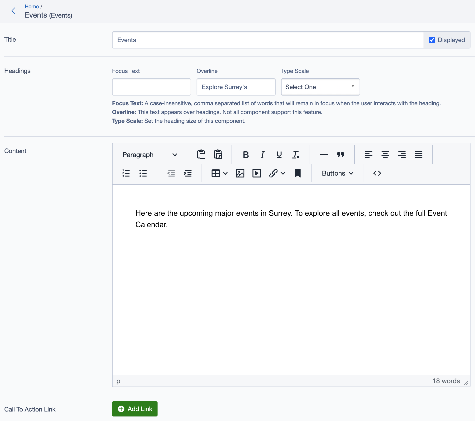
Title: Set the main title for the block, e.g., "Events," which appears as the primary heading.
Headings:
- Focus Text: (Optional) Keywords that stay in focus for user engagement.
- Overline: Smaller text above the main heading, like "Explore Surrey’s."
- Type Scale: Set the heading size for visual hierarchy.
Content:
- Add a brief description or introduction for the event list, e.g.,
"Here are the upcoming major events in Surrey. To explore all events, check out the full Event Calendar."
- Add a brief description or introduction for the event list, e.g.,
Call to Action Links
- Add Link:
- Include call-to-action (CTA) links to direct users to additional resources. Example:
- All Events: Links to a comprehensive event calendar or a full list of events.
- Include call-to-action (CTA) links to direct users to additional resources. Example:
Calendar
- Primary Calendar:
- Select the main calendar for events. Options might include
Primary Calendaror other specific calendars for filtering events.
- Select the main calendar for events. Options might include
Additional Settings
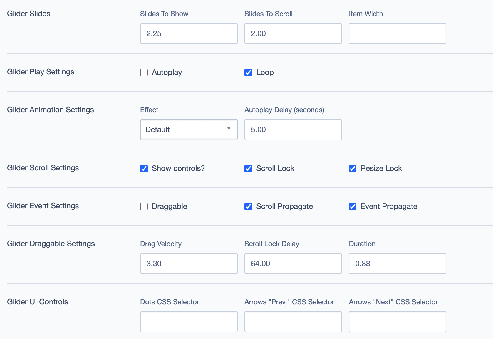
Glider Settings (For Carousel/Slider Display)
The glider settings control how events are displayed in a carousel format.
Glider Slides:
- Slides to Show: Number of slides displayed at once.
- Slides to Scroll: Number of slides scrolled per interaction.
- Item Width: Width of each item in the glider.
Glider Play Settings:
- Autoplay: Automatically cycles through events.
- Loop: Continuously loops events in the glider.
Glider Animation Settings:
- Effect: Choose an animation effect for transitions.
- Autoplay Delay: Set the delay (in seconds) between slide transitions when autoplay is enabled.
Glider Scroll Settings:
- Show Controls: Enable/disable controls for manual navigation.
- Scroll Lock: Locks scrolling to ensure smooth transitions.
- Resize Lock: Locks resizing to prevent layout shifts.
Glider Event Settings:
- Draggable: Allow users to drag and scroll through slides.
- Scroll Propagate and Event Propagate: Manage propagation for interactions within the glider.
Glider Draggable Settings:
- Drag Velocity: Speed of drag motion.
- Scroll Lock Delay: Delay before scroll lock activates.
- Duration: Duration of the scrolling effect.
Display Options
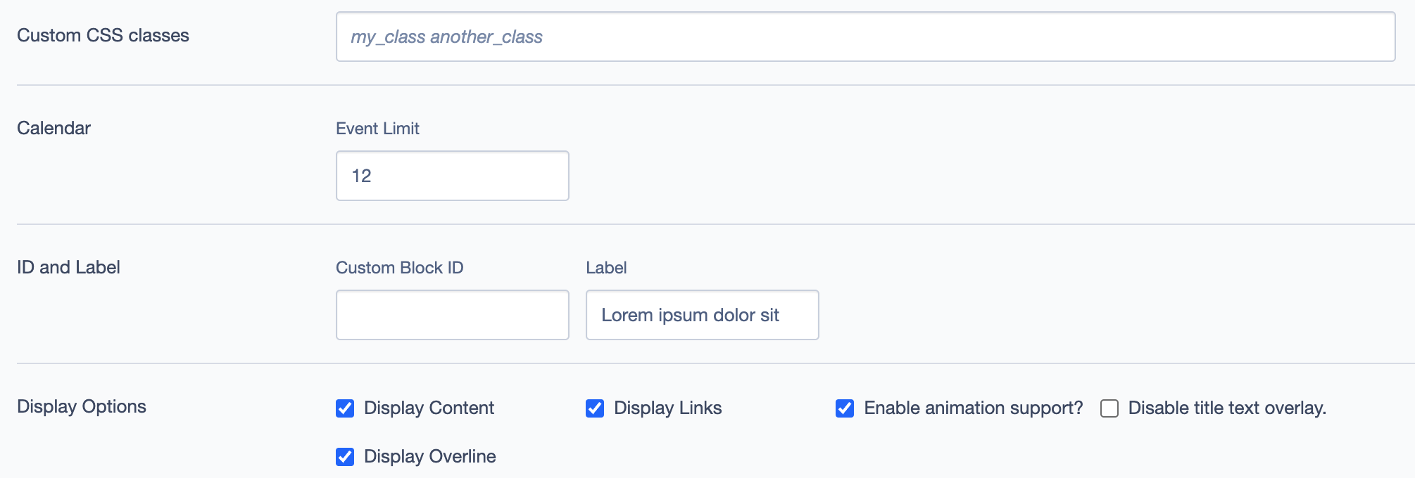
Custom CSS Classes: Add CSS classes for styling.
ID and Label:
- Custom Block ID: Assign a unique ID.
- Label: Set a label for easier reference in the backend.
Display Options:
- Display Content and Display Links: Toggle to show or hide specific content or links.
- Display Overline: Show or hide overline text above the title.
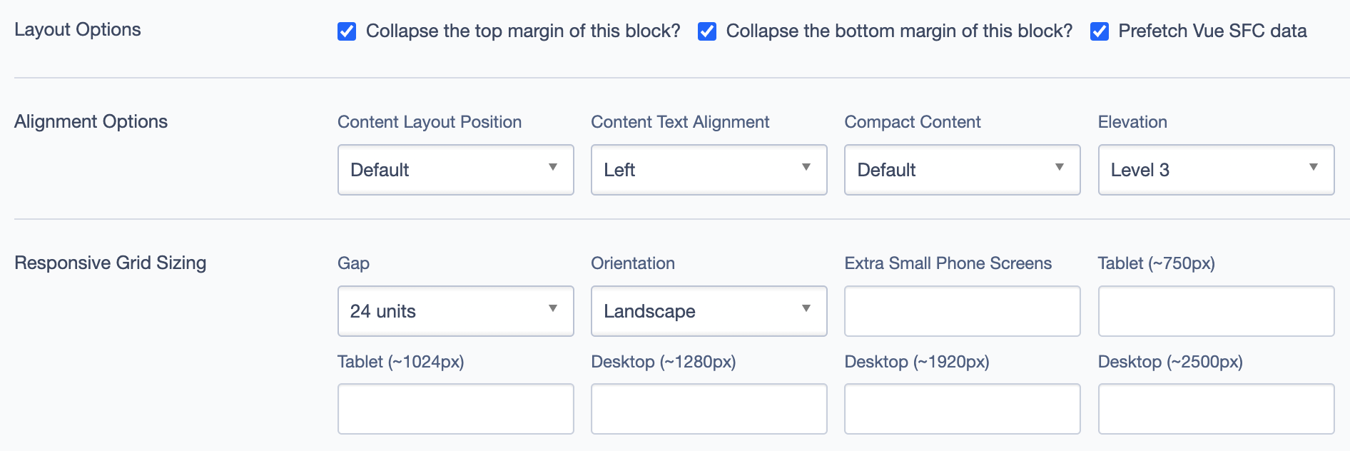
Layout Options
- Collapse Top/Bottom Margins: Controls spacing above and below the block.
- Prefetch Vue SFC Data: Prefetch data to enhance performance.
Alignment Options
- Content Layout Position: Set the layout of content within the block.
- Content Text Alignment: Adjust text alignment.
- Compact Content: Toggle for a more compact content layout.
- Elevation: Set the shadow depth for emphasis.
Responsive Grid Sizing
Define grid behavior for different screen sizes:
- Gap: Set gap between elements.
- Orientation: Select landscape or portrait orientation.
- Extra Small Phone Screens: Specify settings for very small screens.
- Tablet and Desktop: Define responsive behavior for larger screens.
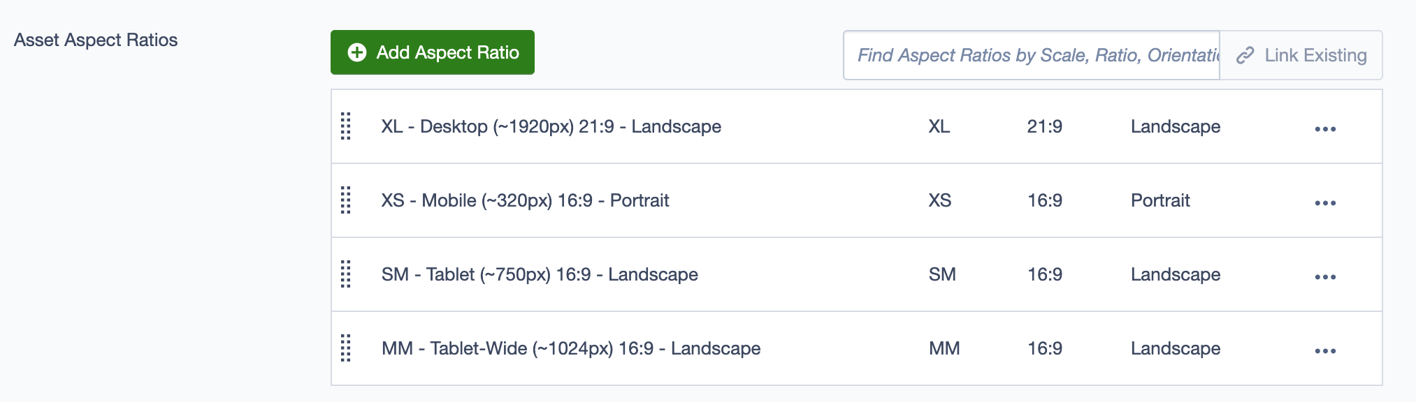
Asset Aspect Ratios
- Add Aspect Ratio: Specify aspect ratios for images within the events display (e.g., 21:9 for Desktop or 16:9 for Mobile).
Custom Inline Styles
- Add Elemental Style Property: Add inline CSS properties for additional styling.
Inline Style Block
- Include custom inline CSS to directly control styles within the block.
Best Practices
- Use this block to feature prominent events or upcoming schedules for user engagement.
- Include relevant images, titles, and brief descriptions to help users quickly grasp event highlights.
- Utilize call-to-action links to direct users to full event details or calendars.
Example Use Case
- Events Overview: Use the
Eventsblock on a city or community page to display upcoming events with a title, brief description, and CTA link to view all events. - Carousel Format: Configure the glider settings for a carousel format, enabling autoplay and draggable options for a dynamic user experience.
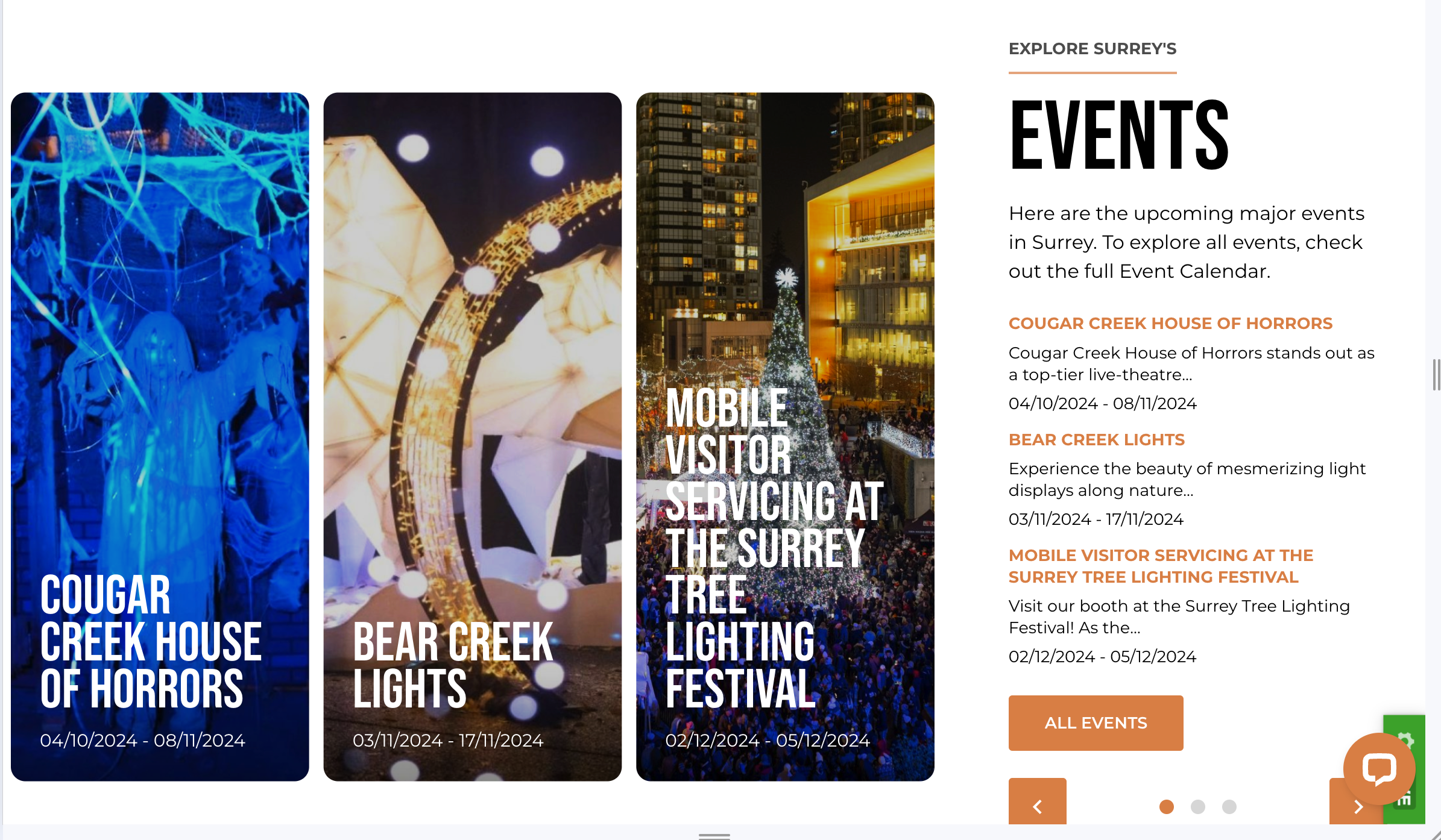
Example Display on Homepage
The Events block is used on the homepage to highlight key upcoming events, helping visitors quickly find information about what's happening in Surrey. This block is strategically placed to draw user attention and encourage engagement with the event calendar.